

In this article, we will learn How to use Histograms plots in Excel.
Scenario:
A histogram is a common data analysis tool in the business world. It’s a column chart that shows the frequency of the occurrence of a variable in the specified range.
A Histogram is a graphical representation, similar to a bar chart in structure, that organizes a group of data points into specified ranges. The histogram condenses a data series into an easily interpreted visual by taking many data points and grouping them into logical ranges or bins.
Histograms in Excel
A simple example of a histogram is the distribution of marks scored in a subject. You can easily create a histogram and see how many students scored less than 35, how many were between 35-50, how many between 50-60 and so on.
There are different ways you can create a histogram in Excel
Note:
Add Data Analysis Toolpak using the link how to add data Analysis Add-In Excel. If you have already added it in, then continue to our histogram tutorial.
Example :
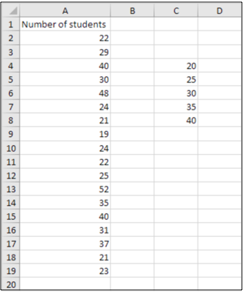
All of these might be confusing to understand. Let's understand how to use the function using an example. Here we have a list of students we need to view the marks distribution of students. For this first we gather the data and proceed to follow the steps explained below.
To create a histogram in Excel 2016 follow these simple steps:
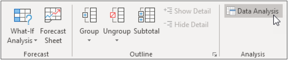
Go to the Data tab and click on Data Analysis
Note: can't find the Data Analysis button? Click here to load the Analysis ToolPak add-in.
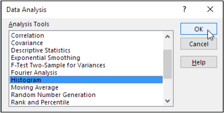
Select Histogram in Data Analysis ToolPak Menu Dialog and hit the OK button as shown in the image above.
This will open up the Histogram dialog box. Feed the arguments as required in the dialog box.
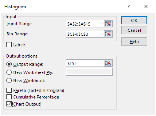
As we have the data in A2:A19 range and bins in C4:C8 range. And also fill the output options as to meet required plot.
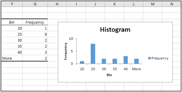
Click the legend on the right side and press Delete. Properly label your bins. To remove the space between the bars, right click a bar, click Format Data Series and change the Gap Width to 0%. To add borders, right click a bar, click Format Data Series, click the Fill & Line icon, click Border and select a color.
As you can see the output plot makes more sense now then before.
Learn Histogram in Excel 2016 or later versions
Now the biggest problem with the above method of creating Histogram in Excel, is its static. It's good when you want to create a quick report but will be useless if your data changes from time to time. You can make this dynamic by using formula. Since it shows frequency distribution, we can use FREQUENCY function of excel, for making excel histogram charts. Lets see how…
So again we have that same data of students and same bin range. Now follow these steps to create a dynamic Histogram in excel 2010, 2013, and 2016 and above.
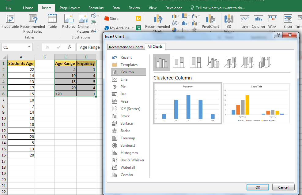
This is an important step. Write heading Frequency in adjacent column of bin range and select all cells adjacent to bin range. Select one extra cell to then bin range as shown in image below.
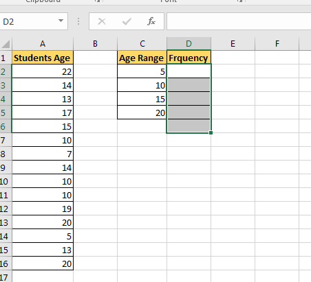
Now click in the formula bar and write this Frequency formula. As a data array, select A2:A16 and as bin range, select C2:C5. Press Control+Shift+Enter. Yup, we need an array formula here. Make sure that you have selected a cell extra then bin range. This is for values found more than the largest bin value. You can name it More or >20.
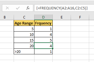
| {=FREQUENCY(A2:A16,C2:C5)} |
Now select this bin range and frequency and goto insert tab.
Goto charts section and select column chart. You can use a bar chart or line chart, but that's not a traditional histogram.
See in the above to view histogram chart created in excel. Now, whenever you’ll change data in excel it will change accordingly. It's best to use named ranges for dynamic histogram in excel.
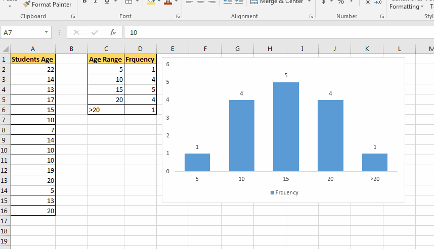
This chart is version independent. You can create this Histogram chart in Excel 2010/2013/2016/2019/365 and any upcoming, since it is based on formula instead of any version specific feature.
In Excel 2013 and 2016, we can directly create a histogram chart by using predefined histogram template in excel. It is useful when you don’t have defined bins for histogram.
Steps to create a histogram directly from charts.
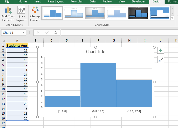
Now you have your Histogram chart. It has predefined bins. You can customise to some extent. You can see it created 3 bins [1-9.8], (9.8-18.6], and (18.6, 27.4]. If you don't want this then you can edit it.
To edit histogram plot
Here are some of the things you can do to customize this histogram chart:
By Category: This option is used when you have text categories. This could be useful when you have repetitions in categories and you want to know the sum or count of the categories. For example, if you have sales data for items such as Printer, Laptop, Mouse, and Scanner, and you want to know the total sales of each of these items, you can use the By Category option. It isn’t helpful in our example as all our categories are different (Student 1, Student 2, Student3, and so on.)
Automatic: This option automatically decides what bins to create in the Histogram. For example, in our chart, it decided that there should be four bins. You can change this by using the ‘Bin Width/Number of Bins’ options (covered below).
Bin Width: Here you can define how big the bin should be. If I enter 20 here, it will create bins such as 36-56, 56-76, 76-96, 96-116.
Number of Bins: Here you can specify how many bins you want. It will automatically create a chart with that many bins. For example, if I specify 7 here, it will create a chart as shown below. At a given point, you can either specify Bin Width or Number of Bins (not both).
Overflow Bin: Use this bin if you want all the values above a certain value clubbed together in the Histogram chart. For example, if I want to know the number of students that have scored more than 75, I can enter 75 as the Overflow Bin value. It will show me something as shown below.
Underflow Bin: Similar to Overflow Bin, if I want to know the number of students that have scored less than 40, I can enter 4o as the value and show a chart as shown below.
Here are all the observational notes using the formula in Excel
Notes :
Hope this article about How to use Histograms plots in Excel is explanatory. Find more articles on calculating values and related Excel formulas here. If you liked our blogs, share it with your friends on Facebook. And also you can follow us on Twitter and Facebook. We would love to hear from you, do let us know how we can improve, complement or innovate our work and make it better for you. Write to us at info@exceltip.com.
Related Articles :
Relative and Absolute Reference in Excel : Understanding of Relative and Absolute Reference in Excel is very important to work effectively on Excel. Relative and Absolute referencing of cells and ranges.
All About Excel Named Ranges : excel ranges that are tagged with names are easy to use in excel formulas. Learn all about it here.
4 Creative Target Vs Achievement Charts in Excel : These four advanced excel charts can be used effectively to represent achievement vs target data. These charts are highly creative and self explanatory. The first chart looks like a swimming pool with swimmers. Take a look.
Best Charts in Excel and How To Use Them : These are some of the best charts that Excel provides. You should know how to use these charts and how they are interpreted. The line, column and pie chart are some common and but effective charts that have been used since the inception of the charts in excel. But Excel has more charts to explore...
Excel Sparklines : The Tiny Charts in Cell : These small charts reside in the cells of Excel. They are new to excel and not much explored. There are three types of Excel Sparkline charts in Excel. These 3 have sub categories, let's explore them.
Change Chart Data as Per Selected Cell : To change data as we select different cells we use worksheet events of Excel VBA. We change the data source of the chart as we change the selection or the cell. Here's how you do it.
Popular Articles :
50 Excel Shortcuts to Increase Your Productivity : Get faster at your tasks in Excel. These shortcuts will help you increase your work efficiency in Excel.
How to use the VLOOKUP Function in Excel : This is one of the most used and popular functions of excel that is used to lookup value from different ranges and sheets.
How to use the IF Function in Excel : The IF statement in Excel checks the condition and returns a specific value if the condition is TRUE or returns another specific value if FALSE.
How to use the SUMIF Function in Excel : This is another dashboard essential function. This helps you sum up values on specific conditions.
How to use the COUNTIF Function in Excel : Count values with conditions using this amazing function. You don't need to filter your data to count specific values. Countif function is essential to prepare your dashboard.
The applications/code on this site are distributed as is and without warranties or liability. In no event shall the owner of the copyrights, or the authors of the applications/code be liable for any loss of profit, any problems or any damage resulting from the use or evaluation of the applications/code.


