
To visualize numeric figures, the charts and graphs are best. And like any analytical tool, excel provides several kinds of charts for different kinds of data.
how many chart types does excel offer?
In excel 2016, there are more than 14 categories of charts that contain several chart types. If we apply a permutation combination than it would more than 100 chart type.
Of course, we will not talk about them all, but we will get introduced to some of the most useful chart types of excel. In this article, we will learn when to use these several chart types in excel.
All charts are found on the ribbon. In Insert? Charts? All Charts
These charts types are:
Without further delay, let's get started.
Excel Column Chart
The column chart is the most commonly used chart type in any tool. The column charts are best used for comparing two or more data points at once. These data points are shown as verticle columns on the x-axis and the height of the column represents the magnitude of the datapoint.
There 3 types of Column Chart in Excel.
1. Clustered Column Chart
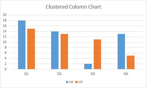
When To Use Excel Clustered Column Chart?
Use it when the within-group comparison is more crucial than in total.
The clustered column chart is used to compare two data points or series within a group.
It is best to use when you have multiple series of data in multiple groups and you want to compare them within the groups.
In the above graph, we can compare Q1’s data in the UK and the US.
The groups Q1, Q2, Q3, and Q4 can also be compared. Although, it may not be clear that much with human eyes.
The stacked column charts are best used to compare two or more groups as well as comparing series within groups.
In a stacked chart, one series’s magnitude is stacked on the other series’s magnitude, giving us the whole magnitude of a group as a column.
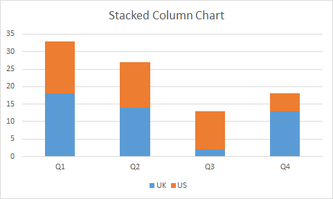
When To Use Excel Stacked Column Chart?
Use a stacked column chart when the total is more crucial than the part.
The stacked column chart is useful when you want to compare multiple groups as well as series within the groups.
In the above-stacked column chart, we can directly compare Q1, Q2, Q3, and Q4. and if we want to compare UK and US withing groups, we can do that too.
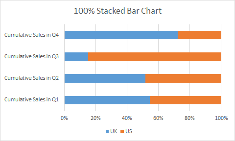
3. 100% Stacked Column Chart
The 100% stacked is used to represent part to whole data. The series of values are shown as a percentage of total in a column.

When to use the 100% Stacked Column Chart?
The 100% stacked column graph is best when you want to see how much someone (something/s) contributed to the whole result in the group.
You can also compare the percentage contribution among groups.
You can’t use it to compare the total of groups of course since the total is 100% for each group.
You can be really creative with column charts. Here is the link to one such chart.
Creative Column Chart that Includes Totals.
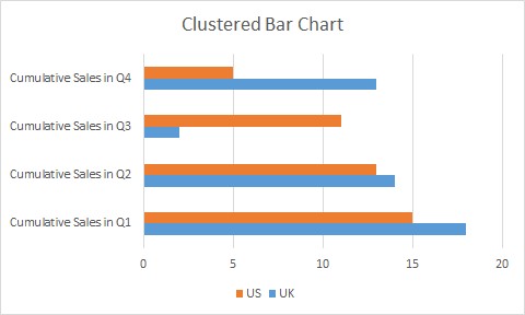
Excel Bar Chart
Excel bar chart is very similar to the excel column chart. The only difference is of column orientation. In the bar chart columns are horizontally oriented.
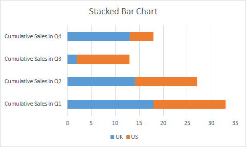
The bar chart or graph has three variations same as a column chart.
Clustered Bar Chart
Stacked Bar Chart
100% Stacked Bar Chart
Column Chart Vs Bar Chart
The question arises, why to use a bar chart if there is no difference in column chart and bar chart apart from orientation.
The bar chart is mostly used when the labels are long and important. If you have long descriptive labels as in the above images, the column chart will not be useful. It will be hard to read.
Another reason is to look and feel. Every chart has its look and feel, so does the bar chart. The bar chart gives the feel of forwarding progress while the column chart gives vertical progress.
You can read this article to get creative ideas with bar and other chart types.
4 Creative Target Vs Achievement Charts in Excel
Excel Line Chart
The line charts are often used to see trends over time. It can also be used to compare two or more groups.
Each data point is connected with a line (straight or smooth) that gives us the look of the trend. The y-axis represents the magnitude, where x-represents time interval (most of the time).
The data points can have markers (called line chart with markers) or not.
In excel, there are three main variations of the line chart, the same as a bar or column chart.
1. Excel Line Chart
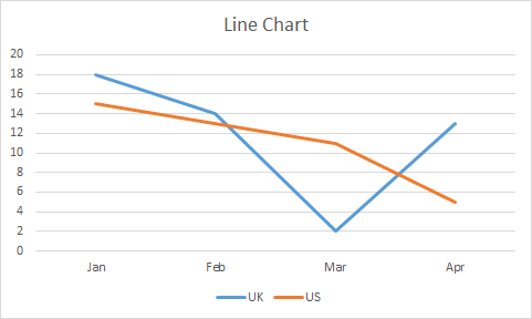
In a simple line chart, each data point is represented as points on the y-axis in the given time. These points are connected with a line, giving a visual feel of trends. In two or more variables, their lines overlap each other.
When to use a line chart in Excel?
When you want to just see trends over time, use a line chart. It is also best used to see competition between two labels.
In the above image, we can see where the UK has downfall and where it has beaten the US.
In financial dashboards, it is common to use line charts.
With two many variables line chart gets confusing.
2. Stacked Line Chart
Stacked Line Chart is used when two series aren’t competing but working cumulatively. The first series starts from 0 on the y-axis and ends at N point. The next series starts from N on the y-axis.
Since the points are cumulative, a stacked line chart never intersects with each other.
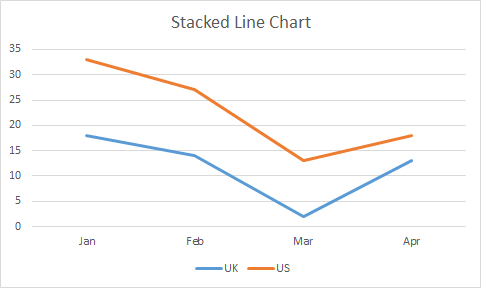
When to use a stacked line chart?
Use a stacked line chart, when different series are working cumulatively.
In the above image, we are not comparing the US and UK but we are analyzing the cumulative effect of both of them.
3. 100% Stacked Line Graph
This line chart is used to show part of the whole effect of two or more series. The lines represent the percentage of the data points. In a two-line chart, If a point represents 10% then the rest is 90% show by the upper line. The uppermost line is always a straight line since it will complete it to 100%.
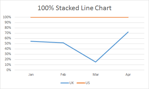
When to use a 100% Stacked Line Chart?
Use a 100% stacked line chart when you want to see trends as part to whole.
With too many series it may get confusing. Use when you have a limited number of series.
There some 4 more line chart types. Three of 'em just are above chart but with markers on a data point. The fourth is a 3D-line chart. We will learn about the 3D line chart in later articles.
Excel Area Chart
Excel Area Chart or Graph, is a variation of a line chart. In the area chart, the area below a series is filled with a color. If it has two or more series than the upper series overlaps below series.
It also has the same 3 variations as a Line chart.
1. Excel Area Chart
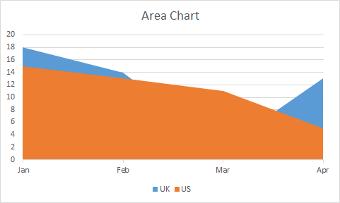
This chart type is best used when you want to see if the last attempting group has overshadowed the first attempting group. For example, in a match, if the UK team scored some points in different months. The US scored some points. Now if we want to check where US has won the match, we can use this chart.
2. Excel Stacked Area Chart
Just like other stacked charts, a stacked area chart is used when we want to see cumulative results as well as individual efforts on the chart.
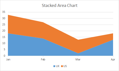
When to use a stacked area chart?
A stacked area chart is best used when we want to see how much of a given area we have covered cumulatively.
Most of the daylight graphs are made using a stacked area chart. You can check it out here.
3. Excel 100% Stacked Area Chart
The 100% stacked area chart is used for showing part of whole coverage, just like other 100% stacked charts. The data is converted into a percentage of total and then the chart is filled with that percentage.
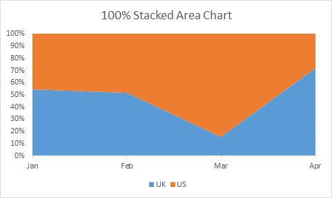
When to use a 100% Stacked Area Chart?
Of course, we will use a 100% stacked area graph when we want to see the percentage of contribution by different groups in a total.
For all 100% stacked charts, it is must to have at least two series. Otherwise, the chart will look just straight colored column, bar, line or an area.
Excel Pie Chart
A pie chart looks like a pie. Dah!.
In all the above charts, we have seen one version for part of the whole chart. But Pie Chart/Graph is the best and most used chart for showing part of the whole data. It is a circular disc cut into different proportions. Each proportion representing the composition of the disk.
Almost everyone is familiar with Pie chart. In news, entertainment and daily office work, we are used to see this chart. Almost every industry uses it. The reason being simplicity and readability.
There are three types of Pie chart. Pie, Pie of Pie and Bar of Pie. There’s one special pie type called Donut chart. We go through that too. We will skip the 3D Pie chart.
Simple Pie Chart
The simple pie chart is used to show the composition of a whole using different categories. In schools, we have seen the composition of air in the pie chart similar to this.
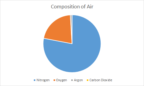
Anyone can easily see that most of the air is nitrogen. Similarly, if we have limited categories (not more than 7) than a pie chart is best to show such kind of data.
When to use Pie Chart in Excel?
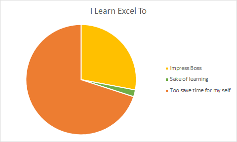
Use a pie chart when you need to show composition or part to whole data. It is best used to show the percentage of the total.
The pie chart can only have one series. For multiple series, we use donut chart.
Pie of Pie Chart
In the above chart, you can’t see the pie of Carbon Dioxide because of it too small. In that case, we use Pie of Pie chart.
The Pie of Pie Chart takes out the smaller group of data and shows them into a different pie. This new pie is connected to main pie piece using two lines.
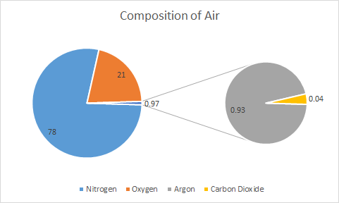
When to use Pie of Pie Chart?
When you have too small pie parts that cannot be seen on the main pie, use Pie of Pie Chart. On main pie, we see a combined piece for those smaller parts of pie.
In above example, we can see that Argon and Carbon Dioxide is too small to show on same pie. We used pie of pie chart to make a different pie chart that shows only these compositions. In main pie it is 0.97 and this 0.97 is further explored in different pie chart.
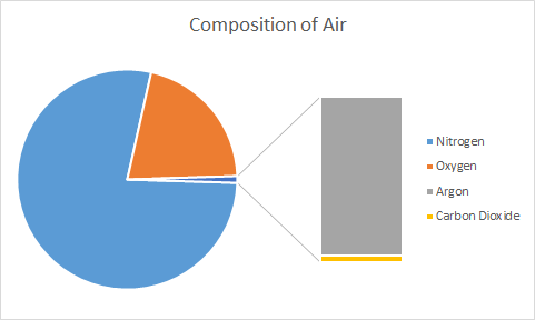
Bar of Pie Chart
It is same as Pie of Pie Chart. The only difference is, instead of a circular pie, it shows smaller part in bar/column connected to main pie.
So, we are done with pie chart. Just remember one thing, we can’t show multiple series on pie chart. For multiple series, we have Donut Chart.
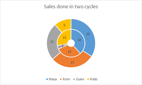
Excel Donut Chart
The Donut chart is another variation of pie chart with a whole in center, whose size can be maintained.
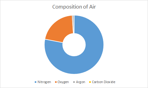
The pie chart has a limitation to show only one series at time. Donut chart does not have that limitation. You can show multiple series in donut chart as circles. But you have to be really careful. It gets confusing sometimes.
Using pie chart and donut chart you can create really creative charts. Here’s one famous speedometer chart tutorial.
Excel Radar/Spider Chart
A radar chart, also known as spider web diagram, is useful when you want to show coverage in different fields by an entity. Like in PUBG game, a players performance is shown on Radar Chart.
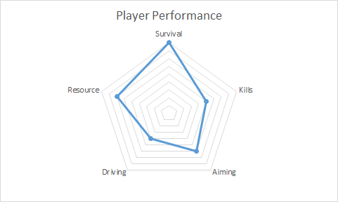
It is easy to visually analyse how good a player was in the game in different fields. The HR department often use this kind of chart to track represent employee performance.
In spider chart, each corner represents an aptitude/competency/etc. The dots/lines/area represents the score or magnitude. Each cycle of lines are markers on y-axis.
It is just like line chart with only y-axis.
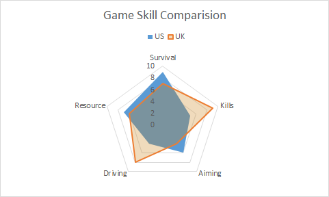
You can use radar chart to compare two or more series.
There are 3 types of radar chart in excel but there is no significant difference among them. These are Radar, Radar with Markers and Filled Radar.
To compare two players/entities we can have this kind of spider web diagram.
When to use to use radar chart in Excel?
Use radar chart when you want showcase skills or anything in comparison to a central value. When you want to show the spread of something, the radar chart can be used. It is good when you don’t have necessary x-axis.
The radar chart with multiple with too many series gets confusing. Use radar chart when you don’t have more than 5 series.
At first glance, an individual may not understand it. You may need to explain the radar chart you used.
XY Scatter Chart
The XY scatter chart is used to show relationship between two variables. It is also called correlation diagram or chart between two variables.
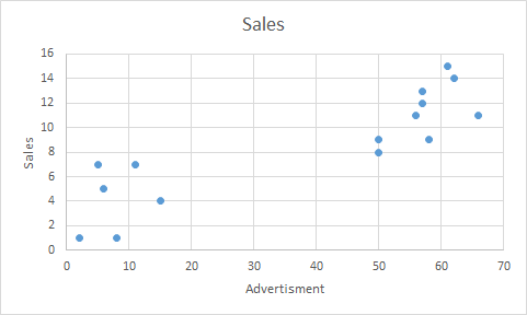
In above chart, we can see that as we increase the advertisement sales to get up.
We can also add trend line and correlation equation of the line to graph in excel.
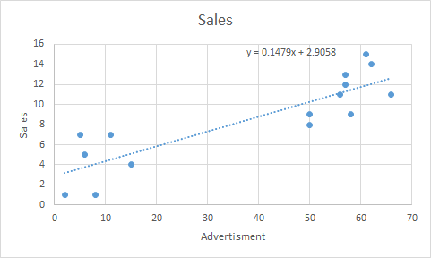
You can see the use of scatter chart in Regressions Analysis in excel.
When to use XY-Scatter Chart?
Use XY scatter chart when you want to show relationship between two variables. They are best used for showing effect of one factor on other in some study. These chart are essential part of analytics.
The Bubble Chart
The bubble chart is a variation of xy scatter chart. In bubble chart, a third dimension is added using color and size of bubble.
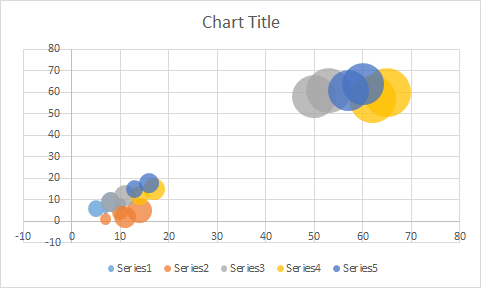
Different colors represents different series and size of bubble represents the magnitude.
When to use Excel Bubble Chart?
When you have to show relationship between two variables on xy plot along with magnitude.
Be careful before using bubble chart. If not formatted well, it can deliver incorrect information. Sometimes bigg bubbles over shadow the small bubbles. If you want it to happen, then it idle, else use simple xy scatter chart instead of Bubble Chart.
Excel Histogram Chart
The histogram is chart that shows the frequency of something in a range of values.
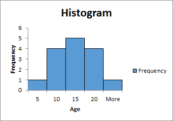
Most of the times columns/bars are used to create the histogram chart but they are not bar chart.
In histogram chart, height of a column represents the frequency of variable in range or bin. Higher the height of column higher the frequency.
The area covered by histogram is also very important. The width of column represents the bin (range).
Learn how to create Histogram chart in Excel.
When to use Histogram Chart?
The histogram chart is widely used in analytical projects to represent area covered by different ranges. Use it when you want visualise the frequency of different groups of data.
In above image, we have shown the frequency of age groups. Most of the people are of 10-20 years. 10-15 years of people are 5.
Excel Combo Charts
The combination of multiple chart types are called combo chart. In excel we can combine only two chart types.
When one type of chart is not enough to visualise the information then we use combination of excel charts. Like column chart with line chart, Pie chart with donut chart etc.
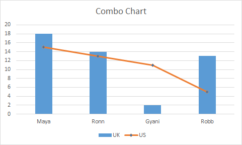
The combo chart are easy to read and attention drawer. It can easily show relation between two series independently.
The Speedometer chart is created using combination of pie chart and donut chart.
Some Special Excel Charts
Excel provides some special chart types.
Treemap Chart
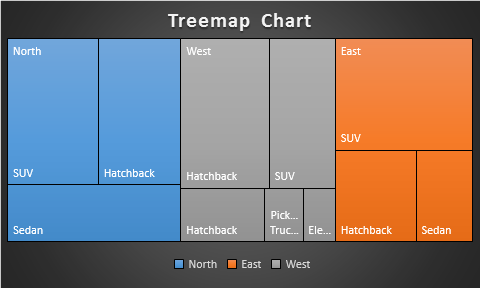
This is a hierarchical chart that is used to visualise hierarchical data. The treemap chart is uses colored boxes to represent difference branches/categories.
The number of boxes represents categories and the size of boxes represents the magnitude or value.
Here I have created a separate article to illustrate the use of treemap chart in excel. Do read it.
Sunburst Chart
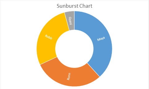
This is also a hierarchical chart type. The sun burst chart looks like a donut chart, but it has some other properties. Since it is an special chart, I have prepared a different article on this.
Excel Box & Whisker Chart
The box and whisker chart is analytical graph that shows a five number analysis using median. It is an complex chart type used in analytics and hence we have a separate article on Excel Box and whisker chart.
Excel Waterfall Chart
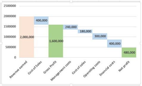
Waterfall charts are charts build on a logic that the start value of the next bar starts from the end value of the previous bars of the chart. The Waterfall chart is widely used for project management and financial tracking. Excel provides some built in waterfall diagram to use but I rather use my custom build waterfall chart. If you want to learn how to build the waterfall chart in excel, follow this link.
So yeah guys, these are some main excel chart types that we use in excel. In this article, I have just have introduced them to you. We learned how and when to use these chart. For each of these chart I have separate articles. You can click on the headings to get to those articles. In those articles, I have explained how to use them with examples and scenarios. We covered the benefits and drawbacks of chart types too.
Related Articles:
Excel Sparklines: The Tiny Charts in Cell
Speedometer (Gauge) Chart in Excel 2016
Creative Column Chart that Includes Totals
4 Creative Target Vs Achievement Charts in Excel
Popular Articles:
The applications/code on this site are distributed as is and without warranties or liability. In no event shall the owner of the copyrights, or the authors of the applications/code be liable for any loss of profit, any problems or any damage resulting from the use or evaluation of the applications/code.


