 In predicting the required salesmen to achieve a sales target, we used Regression in Excel, in our previous example. Using regression analysis, we found that you need a certain number of salesmen to achieve sales targets. But even after hiring all of that workforce, you still haven't achieved your target. Why? Who is the culprit?
We are going to find out that culprit or culprits. You can decide later what to do with them.
The Pareto analysis states that your 80% problem is caused by 20% of factors. Or we may say that by working on only 20% of cases you can solve your 80% of problems. Fascinating, right? The method is also famous as the 80/20 rule. It is named after its inventor, Vilfredo Pareto.
You hired staff and expected to get higher sales of your soft drinks but you were disappointed. Indeed you are disappointed but not in the mood of quitting the business. You are a fighter. You decide to track down the problem. For that, you conducted a survey.
You asked these questions to the public:
If not then why not?
After your survey is done, you've got these stats:
| Will Buy | Observations |
| Yes | 253 |
| No | 247 |
| Total | 500 |
Out of 500, 253 people said yes, they will buy your soft drink and 247 people said they won’t buy it for several reasons. Our focus will be on these 247 observations.
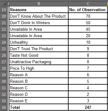
Based on the data, we found out 14 main reasons for:
Why these possible customers will not buy your soft drink?
Step 1: Sort data in descending order in excel.
To sort data, select the data range (don’t select Total Cell) and hit ALT, A, S, S one by one (keyboard shortcut for sorting). You can use the mouse to do so from the data tab. But I prefer the keyboard only.
In ‘Sort By’ dropdown menu, select ‘No. of Observations’
On the 'Sort On’ dropdown menu, select ‘Values’
On the 'Order' dropdown menu, select ‘Largest to Smallest’
Hit Ok.
The table is now arranged in descending order.

Step 2: Find Cumulative Frequency
Finding it is easier than speaking its name. It's just additions. You add your next number to the sum of your previous numbers.
For example, if you have 1,2,4,5,8 as your data then your cumulative frequency will be 1, 1+2, (1+2)+4, ((1+2)+4)+5, (((1+2)+4)+5) +8. The cumulative frequency for 1,2,4,5,8 is 1, 3, 7, 12, 20. Easy, isn’t it?
Let's do the same in our data. The first value will be the same, 70. Next 70+50, that is 120. The next 120+45, that is 165 and so on.
The last frequency will be equal to the total number of observations.
In cell D3, write
=C3
Since there is no number before that we just get that value.
In cell D4, write
=D3+C4
In cell D5, write
=D4+C5. Do this for all observations.
Result:
Step 3: Find Cumulative%. This one is easy peasy too. Just divide the cumulative frequency by the total number of observations.
In the cell of E4, write
=D3/$C$17
Here I have locked the C17 as it contains a total number of observations and I don’t want it to change while copying the formula in the cells below.
Finally, you will have a table like this.
Step 4. Give Code Names to Reasons (Optional).
Now, let’s give code names to reasons because these long reasons will not look good on the chart.
Step 5: Plot a Chart:
Pareto Chart in Excel 2016:
If you just want to plot a Pareto Diagram in Excel 2016. In excel 2016 you do not need to do all of the above procedures. Just select your un/sorted data and goto
Insert -> Recommended Charts -> All Charts -> Histogram -> Pareto Chart

Let’s plot pareto chart with an example
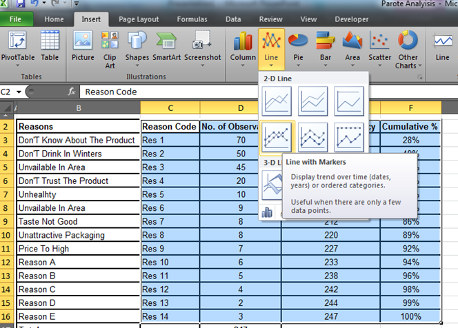
Select your data from the Reason Code for Cumulative%.
Go to Insert -> Line -> Line with Markers

You will have a chart that looks like this. This is not what we want. So let's modify it.
Step 5. Remove Non-Required Data.
Here we only need No. of Observations and Cumulative%, which means we need to get rid of cumulative frequency from this chart.
Right click on the chart and click on “Select Data”.
“Select Data Source” window will be displayed.

Select “Cumulative Frequency” and Click on the remove button. Now, this is what you have.
It still doesn't look like what we want.
Step 6. Make Cumulative% a secondary axis.
Right click on the Cumulative% line. Click on the Format Data Series option. You will have a window opened in front of you.
Select the Secondary Axis radio button and hit it close.
Now we have this chart. We just need to convert the “Number of Observations” line graph into a bar graph.

Step 7. Change No. of Observation into the Bar graph.
Right click on the “No. of observation” and click on the “Change Series Chart Type” option.
Select “Clustered Column” and hit “OK” Button.
Now, this is what we wanted. This is a classic Pareto Chart.

Step 8: Add Data Labels.
Right Click on the Cumulative% line and click on “Add Data Labels”.
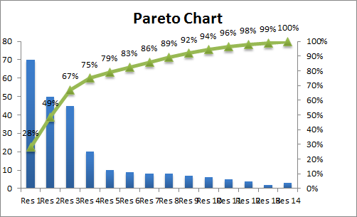
And it’s done. This is the Pareto Graph for our data.
From this chart, we can say that 67% of problems are due to Res 1, Res 2, and Res 3. And they are People who Don't Know About The Product, Don't Drink In Winters and Unavailable In Area.
Hence, if you can eliminate these 3 problems, you will recover 67% of your customers.
In this session, we learned how to do the Pareto Analysis easily. I tried to explain each and everything with examples. I hope it was resourceful for you. If you missed your query, feel free to ask in the comments section. I am quite active here.
Related Articles:
How to use the Waterfall Chart in Excel
4 Creative Target Vs Achievement Charts in Excel
How to Create Histograms in Excel 2016/2013/2010 for Mac and Windows
Popular Articles:
50 Excel Shortcut to Increase Your Productivity
How to use the VLOOKUP Function in Excel
How to use the COUNTIF function in Excel 2016
How to use the SUMIF Function in Excel
The applications/code on this site are distributed as is and without warranties or liability. In no event shall the owner of the copyrights, or the authors of the applications/code be liable for any loss of profit, any problems or any damage resulting from the use or evaluation of the applications/code.