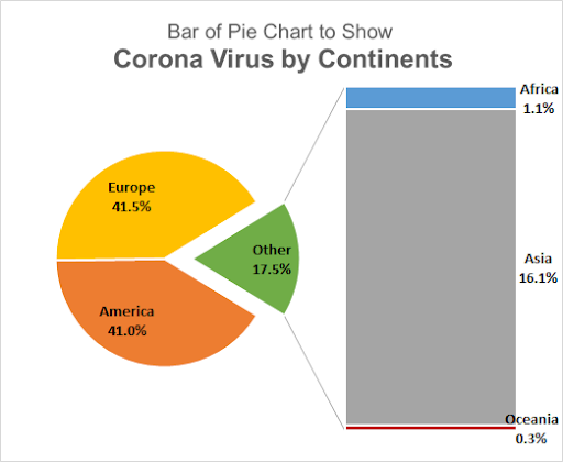
A bar of pie chart is a type of pie chart that has a bar attached to it. This bar expands a group of values that can't be shown on the same pie chart.
As we know, a pie chart is good for showing how much is something part of a whole. But with too many categories or participants, the pie chart gets confusing. We combine the smaller slices of pie chart into and show it as a whole pie chart, by default named another. To see who or what is the part of this other slice of pie chart, we use the bar of pie chart. This bar contains all the members of other groups and shows how that other group was created.
Before we delve into how to add parts to the bar in the pie chart, let's create one.
Here, I have data of Covid 19 cases by continent in a table. The situation is bad. I want to show America and Europe separately on the chart and all other continents into 1 group. For that I will use a Bar of Pie Chart type. To insert a bar pie chart in Excel, follow this tutorial:

Select the table. Go to the Insert tab of ribbon. Now from chart groups click on pie charts. Here you will find the bar of pie charts.

This will insert a bar chart and pie chart together. That makes no sense at first glance.
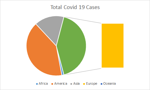
So if you see, currently this chart shows Africa, America, Asia and Oceania as whole in pie chart but it takes our Europe out. We don't want it. We want Europe and America in the pie chart separately as they have most cases and of the continents in others slice of pie.
How to Add Slices of Pie to the Bar of Pie (or Pie of Pie)?
To customize this bar of pie charts, follow these steps:
Right click on any slice of pie chart and click on the Format Data Series option. This will open a slide on the right of the excel screen. Click on the Series option. You will have the options below available to you.

In Split Series By drop down select custom. Now double click on the bar chart (or any slice that you want to move to the other part of the chart). This will make one more option visible. The option of Points Belongs To.

It shows, to which part of the chart the currently selected option point belongs too. In our case currently the selected point is Europe. Which belongs to the second plot.
To move the selected point to other plot of the chart, click on the drop down and select the first plot.

Do this for every point you want to move from one plot to another. Here I want Asia, Africa and Oceania into the second plot. So I move them one by one to the second plot using the step above. And finally I will have this.

Now it looks cleaner.
Please add the data labels to show the percentage. Click on the plus sign on the left of the selected chart. Check the Data labels option.

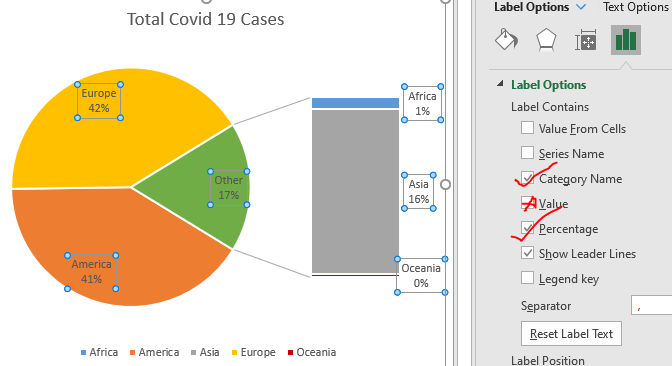
It shows the numbers but we want percentages to be shown on the bar and pie chart with the continent name.
To do so, click on the data labels and go to labels of the formatting option. Here check percentage and series name and uncheck the value.
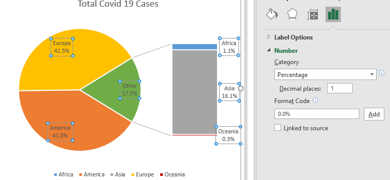
Now to show decimal points, move down in the same pane and expand numbers option. Here, in categories, select percentages. In decimal places, select 1.
Now we don't need the legends so delete them.
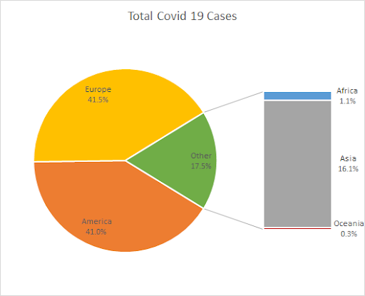
The data labels of pie and bar chart are too dim to see. So make them bold bigger and brighter.

If you want to take out the other slice of pie chart a little out, you can just increase the explosion from the series option. Just select the other slice by double clicking on it. Go to formatting and increase the explosion.
If you want to increase the size of the column in the pie chart, you can do that too here by increasing or decreasing the plot size of the second plot.
Name the chart title properly.

We have our bar of pie charts ready.
So yeah guys, this is how you can create and use a bar of pie charts in Excel. This chart comes really in handy when there are too many categories to show on one single pie chart. I hope this tutorial helped you understand when you should use a bar of pie chart in Excel. If you still have any doubts regarding this chart or any other Excel/VBA topic, let me know in the comments section below. Until then, you can check out the below mentioned chart articles.
Related Articles:
Best Charts in Excel and How To Use Them : These are some of the best charts that Excel provides. You should know how to use these charts and how they are interpreted. The line, column and pie chart are some common and but effective charts that have been used since the inception of the charts in excel. But Excel has more charts to explore…
10+ Creative Advanced Excel Charts to Rock Your Dashboard | These creative charts can make you stand apart from the crowd. These charts can be used for different types of reports. Your dashboard will be more expressive than ever.
How to Save and Use an Excel Chart Template | It is important to save chart templates for repetitive charts to save time and energy. To save chart templates in excel, follow these steps:
4 Creative Target Vs Achievement Charts in Excel : These four advanced excel charts can be used effectively to represent achievement vs target data. These charts are highly creative and self explanatory. The first chart looks like a swimming pool with swimmers. Take a look.
Excel Sparklines : The Tiny Charts in Cell : These small charts reside in the cells of Excel. They are new to excel and not much explored. There are three types of Excel Sparkline charts in Excel. These 3 have sub categories, let's explore them.
Change Chart Data as Per Selected Cell : To change data as we select different cells, we use worksheet events from Excel VBA. We change the data source of the chart as we change the selection or the cell. Here's how you do it.
Popular Articles:
50 Excel Shortcuts to Increase Your Productivity | Get faster at your task. These 50 shortcuts will make you work even faster on Excel.
How to use Excel VLOOKUP Function| This is one of the most used and popular functions of excel that is used to look up value from different ranges and sheets.
How to use the Excel COUNTIF Function| Count values with conditions using this amazing function. You don't need to filter your data to count specific value. Countif function is essential to prepare your dashboard.
How to Use SUMIF Function in Excel | This is another dashboard essential function. This helps you sum up values on specific conditions.
The applications/code on this site are distributed as is and without warranties or liability. In no event shall the owner of the copyrights, or the authors of the applications/code be liable for any loss of profit, any problems or any damage resulting from the use or evaluation of the applications/code.