
In this article, we will learn How to copy and paste chart formatting in Excel.
Scenario:
Many of us, while working with advanced charts in Excel, sometimes come across a problem of copying the formatting of one chart to another. It usually happens when you are working with advanced charts where you invested a lot of time in one chart and now obtaining the new dataset we need to plot a new chart having the same formatting as the previous one. This will save a lot of time and can perform charts in a much easier way.
How to solve the problem?
For this, we will use Ctrl + C to copy charts and Paste Special to paste formatting on the chart. This isn't easy at its seems, but will be easy after you will look how this process is performed by an example given below.
Example :
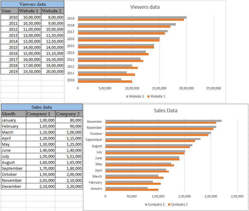
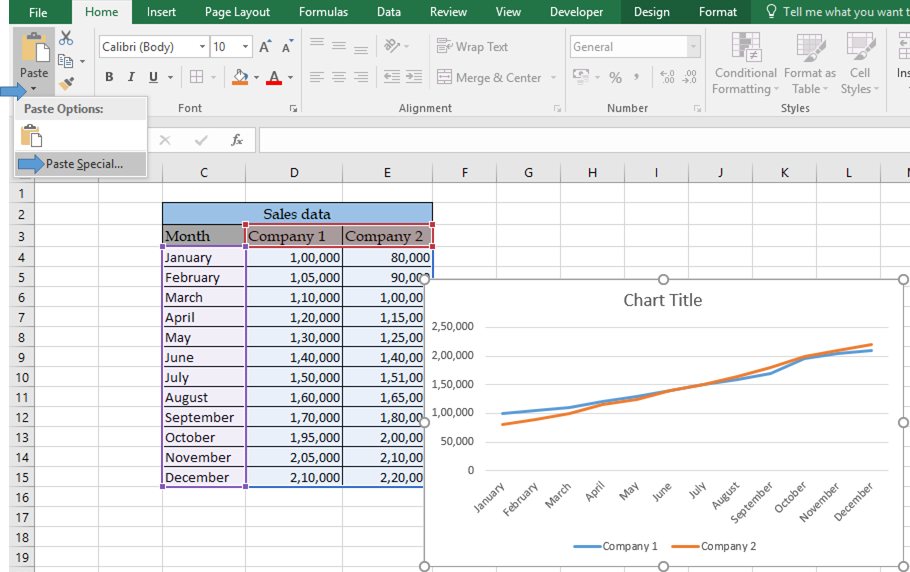
All of these might be confusing to understand. Let's understand this with a sample chart for one dataset and pasting the formatting into another chart for the different dataset. For example, see the below chart made for the dataset.
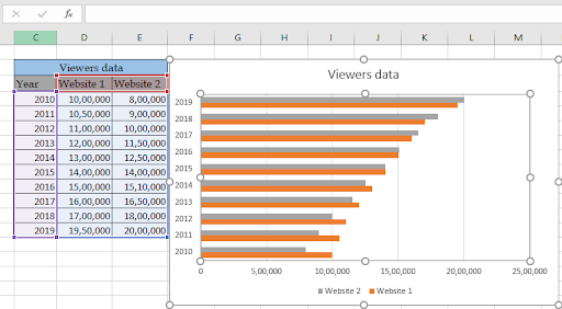
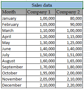
The above shown chart represents the viewers data of two websites of the year wise basis and we need to use the same formatting for another set shown below.
Follow the below process to copy and paste formatting.
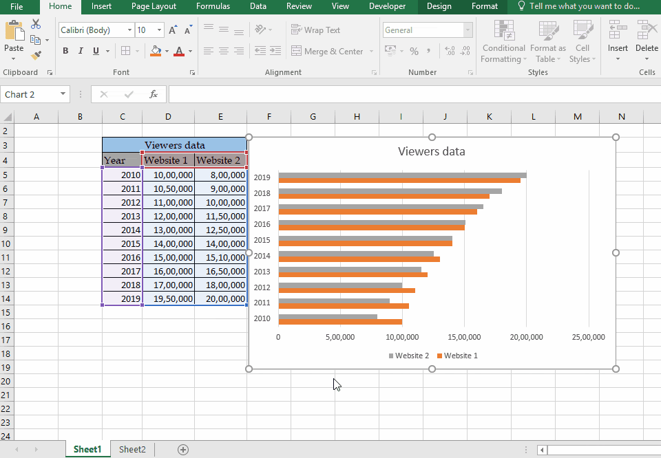

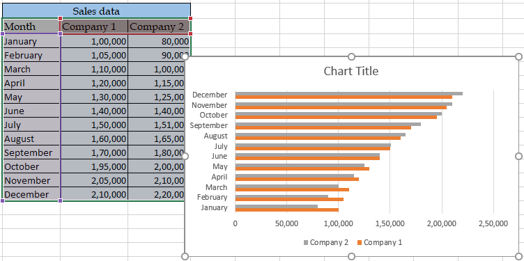
As you can see we changed the whole graph formatting using the simple copy and paste option. This one way of getting the format as the chart required. You can also use a chart template to get the same formatting.
Here are all the observational notes regarding using the formula.
Notes :
Hope this article about How to copy and paste chart formatting in Excel is explanatory. Find more articles on different types of charts and their corresponding advanced charts option here. If you liked our blogs, share it with your friends on Facebook. And also you can follow us on Twitter and Facebook. We would love to hear from you, do let us know how we can improve, complement or innovate our work and make it better for you. Write us at info@exceltip.com
Related Articles:
How to Create Gantt chart in Microsoft Excel : Gantt chart illustrates the days as duration of the tasks along with tasks.
4 Creative Target Vs Achievement Charts in Excel : These four advanced excel charts can be used effectively to represent achievement vs target data. These charts are highly creative and self explanatory. The first chart looks like a swimming pool with swimmers. Take a look.
Best Charts in Excel and How To Use Them : These are some of the best charts that Excel provides. You should know how to use these charts and how they are interpreted. The line, column and pie chart are some common and but effective charts that have been used since the inception of the charts in excel. But Excel has more charts to explore.
Excel Sparklines : The Tiny Charts in Cell : These small charts reside in the cells of Excel. They are new to excel and not much explored. There are three types of Excel Sparkline charts in Excel. These 3 have sub categories, let's explore them.
Change Chart Data as Per Selected Cell : To change data as we select different cells we use worksheet events of Excel VBA. We change the data source of the chart as we change the selection or the cell. Here's how you do it.
Popular Articles:
How to use the IF Function in Excel : The IF statement in Excel checks the condition and returns a specific value if the condition is TRUE or returns another specific value if FALSE.
How to use the VLOOKUP Function in Exceln : This is one of the most used and popular functions of excel that is used to lookup value from different ranges and sheets.
How to use the COUNTIF Function in Excel : Count values with conditions using this amazing function. You don't need to filter your data to count specific values. Countif function is essential to prepare your dashboard.
How to use the SUMIF Function in Excel : This is another dashboard essential function. This helps you sum up values on specific conditions.
The applications/code on this site are distributed as is and without warranties or liability. In no event shall the owner of the copyrights, or the authors of the applications/code be liable for any loss of profit, any problems or any damage resulting from the use or evaluation of the applications/code.


