An Excel chart is excellent tool for visualizing data. Excel charts can display complex data in easiest ways and user can get meaningful information from it.
Excel charts have many chart template that are sufficient to visualize most of the data. But most of the time user needs to customize the charts. Sometimes because they need to match the theme of the dashboard or presentation and sometimes because the default Excel charts does not full fill the requirement.
We can do the customization of chart manually if it is one time task but it is not smart to do same customization of charts again and again. In that case we, create an Excel custom chart and same save them as Excel Chart Templates to use them later in reporting. In this article, we will learn how to create a custom chart and save them as an Excel chart template.
So, first we need to create a chart template. For that we need a data set.
Here we have a data of sales and productivity of a department in different months.

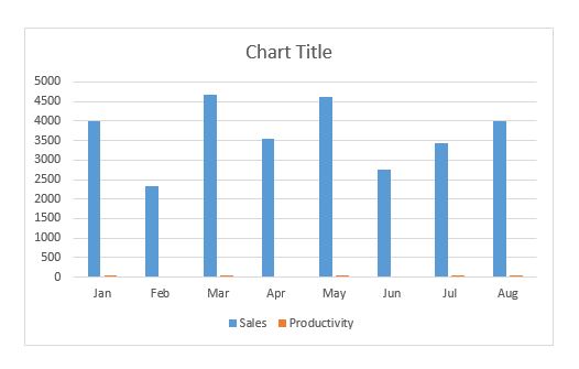
Now select this data, and press the CTRL+F1 to shortcut to insert a default embedded chart in Excel. Or you can go to insert--> charts and insert a chart of your choice. I used the shortcut to insert the chart. The default chart looks like this.
 Now this default does not represent the data accurately. We can only see the sales columns. The productivity columns can't be seen clearly as they are too small as compared to sales. The chart does not have any theme or appeal. We definitely need to edit and customize it to our needs.
Have a secondary axis for productivity
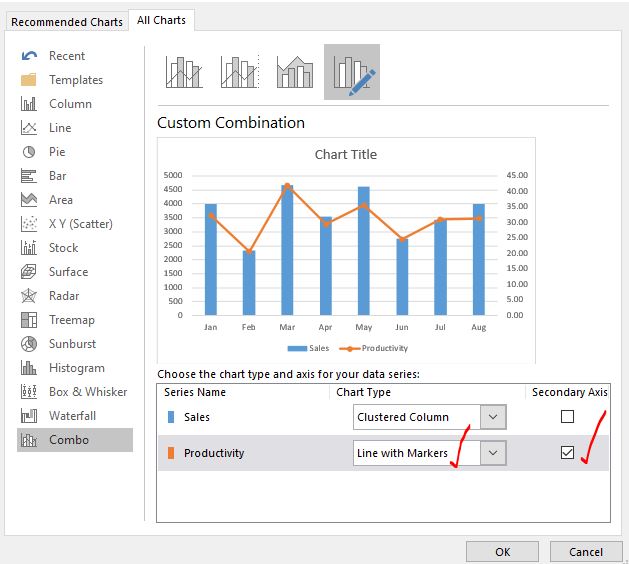
Right click on the chart and click on the change chart type option. Go to combo option.
Here, click on secondary axis check box for productivity series. Change the chart type for productivity series to line with markers.

Hit the OK button. We have a chart that looks like this and tells more story than the default chart.

Format the chart as per the theme of dashboard:
The theme of my chart is purple. I colored the columns and line in the chart in shades of purple from the format option of the chart.

I colored the background of the chart too. Added the chart title as "Sales and Productivity". Removed the grid lines for cleaner look.

I increased the width of the columns by reducing the gap width between them. Added the data labels for both series. Done some more foramating that you can see in the below image. I am not explaining how I did them. I am sure you will do your own formatting.

Now I have this chart that suits my dashboard. I have done several formatting to create this chart. Now if I have to create this chart with some different data, I may not remember what I had did (most of the time I forget). In that case I will save this chart as template and use it whenever I want it.
To save this chart as chart template follow these steps:
1: Right click on the chart and click on the "Save as Template..." option.

Step 2: Name and Save the chart template at desired location.
The above step will open a save as dialog box. The save filter is set to Chart Template File. The extension of a chart template is .crtx which you don't need to mention. The default location of chart templates is Microsoft/Templates/charts. You can change if you want.

Click on the save button. And it is done. The chart template is saved.
So we have saved our chart template. Now I have a new data of salesmen and the average sales in different years.

Now this data is different from the data we used earlier but the structure is same. We can use the same chart we created for the sales and productivity analysis.
Select the data and go to:
Insert --> Charts --> Recommended Charts. Here excel will show some recommended charts for your data. Ignore them and switch to All Chart Tab.
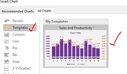
Here on the top, you will see a folder named templates. Click on it. Here you have all your saved chart templates. For now we have only one chart template here.

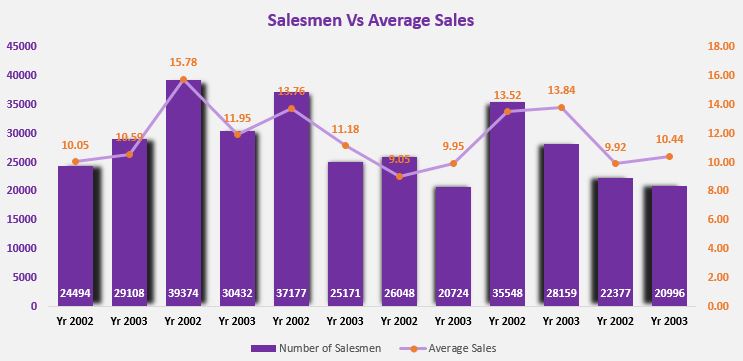
Select the chart and hit OK button. And you have your custom chart ready. You do not need to edit it much to make it suit the dashboard style.

Although the chart have the same format of the previous chart but note few points. The chart title is not set. The size of chart is not set. These you need to set your self. Which is explainable.
So set the name of the chart and adjust the size of chart so it fits.

And it is done.
Easy! isn't it? This saves a lot of time to invest in more important thinks.
So yeah guys, this is how you can create a chart template in Excel and use the template. I hope it was helpful. If you have any doubts regarding this article or any other excel/VBA related topic, ask in the comments section below.
Related Articles:
4 Creative Target Vs Achievement Charts in Excel : These four advanced excel charts can be used effectively to represent achievement vs target data. These charts are highly creative and self explanatory. The first chart looks like a swimming pool with swimmers. Take a look.
Best Charts in Excel and How To Use Them : These are some of the best charts that Excel provides. You should know how to use these chart and how they are interpreted. The line, column and pie chart are some common and but effective charts that have been used since the inception of the charts in excel. But Excel has more charts to explore...
Excel Sparklines : The Tiny Charts in Cell : These small charts reside in the cells of Excel. They are new to excel and not much explored. There are three types of Excel Sparkline charts in Excel. These 3 have sub categories, let's explore them.
Change Chart Data as Per Selected Cell : To change data as we select different cells we use worksheet events of Excel VBA. We change the data source of the chart as we change the selection or the cell. Here's how you do it.
Popular Articles:
50 Excel Shortcuts to Increase Your Productivity | Get faster at your task. These 50 shortcuts will make you work even faster on Excel.
How to use Excel VLOOKUP Function| This is one of the most used and popular functions of excel that is used to lookup value from different ranges and sheets.
How to use the Excel COUNTIF Function| Count values with conditions using this amazing function. You don't need to filter your data to count specific value. Countif function is essential to prepare your dashboard.
How to Use SUMIF Function in Excel | This is another dashboard essential function. This helps you sum up values on specific conditions.
The applications/code on this site are distributed as is and without warranties or liability. In no event shall the owner of the copyrights, or the authors of the applications/code be liable for any loss of profit, any problems or any damage resulting from the use or evaluation of the applications/code.