
A dashboard in Excel shows the summary and analysis of a large data set in a digestible and readable manner. And without Charts, a Dashboard will be nothing but a bunch of numbers and text. Even a dashboard that uses normal Excel charts is not very good for presentation in business.
Amazing Excel dashboards use amazing Excel charts. This article lists some of the most creative and informative charts that can make your dashboards and presentations stand out.
So, here are 15 Advanced Excel charts for you. You can download the chart templates too.

A waffle chart is a square grid that contains smaller grids. This creative chart is best used for showing the percentage. In the gif above, you can see how inventively it shows the active users from the different regions of the country. The chart is so easy to read that anyone can tell what it is telling.
The waffle chart does not use any actual excel chart. We created a waffle chart using conditional formatting on cells of the sheet.
You can learn how to create a waffle chart here.
Advantages:
This chart is easy to understand and precise. It does not mislead the users.
Disadvantages:
It gets confusing when more than one data point is visualized in one waffle chart. It also takes effort to create this creative chart as there is no default chart option available for this chart type.
They are not good for showing fractional values.
This is not an Excel Chart but they are conditionally formatted cells. Hence they don't provide the facilities of an Excel Chart.
Download the template for the Excel Waffle chart below:

This is similar to a waffle chart but instead of the percentage, it shows the density of data in a grid. Using this advanced excel chart, we show where the most of the data is concentrated and where it is less concentrated using dark and light colors.
In this creative excel chart, the lightest color shows the smallest number and the darkest color shows the largest number. All the other color plates show the numbers between the largest and smallest numbers.
Advantage:
It's easy to see when your website is most in use and when most of the users use your website.
This chart is easy to create as we simply use conditional formatting.
Disadvantages:
This is not an Excel Chart but they are conditionally formatted cells. Hence they don't provide the facilities of an Excel Chart.
To learn how to create a density grid chart, click here.
You can download the template of this advanced excel chart below.
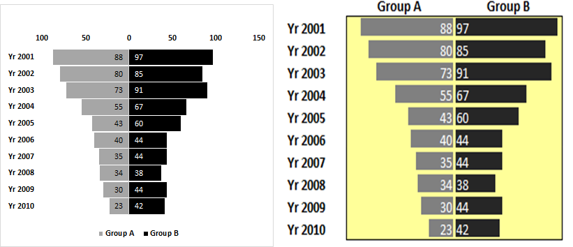
A tornado or funnel chart is used to compare two groups of values side by side. A tornado chart is the easiest way to visually compare two groups that contain multiple data points. It is sorted in descending order by one of the groups. It is best used for sensitivity analysis.
This chart can be created using two methods. One is the Bar chart method and other is the conditional formatting method. Both methods can be used to create an advanced tornado chart.
Click here to learn how to create such an advanced excel chart.
Advantages:
It is to do sensitivity analysis with a Tornado chart in Excel. You can compare the data side by side. It looks highly professional. There is more than one method to create this chart. Analysts can choose which method to use as per their skill and requirement.
Disadvantages:
This chart is a little bit tricky to create when the bar chart is used. It can only have two series to compare at a time.
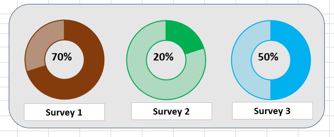
Usually we use progress bars to show the completion of tasks but you can see that a circular progress bar looks a lot cooler than a straight progress bar.
This advanced excel chart uses a doughnut chart to show the completion percentage of a survey, task, target, etc.
This creative chart can make your dashboards and presentations more appealing and easy to understand.
To learn how to create this creative chart, click here.
Advantages:
This chart looks stunning. It is easy to understand and delivers the information easily. It is good for showing the completion percentage of some process or task.
It is easy to create.
Disadvantages:
It can't be used to show more than one series. If you try, it will be confusing.
You can download the template of this excel chart below.

This is an updated version of the circular progress chart you have seen above. This creative chart uses a doughnut chart that is divided into equal fragments. These fragments of chart are highlighted with darker colors to show the progress of the tasks.
The fragmented circular chart in excel is easy on the eyes, can be read by anyone easily, and visually appealing.
The drawback of this chart is that it can't be used to show multiple data points. It also takes a little effort to create such a chart in excel.
You can learn how to create a fragmented chart here to creatively show data in dashboards and representations.
Advantages:
It makes the dashboard look more analytical and professional. It is easy to understand and delivers the information easily. It is good for showing the completion percentage of some process or task.
Disadvantages:
It takes some effort to create this chart. It can't be used to show more than one series. If you try, it will be confusing.
If you want to directly use the fragmented excel progress chart, download the template below.
Fragmented Progress Chart in Excel
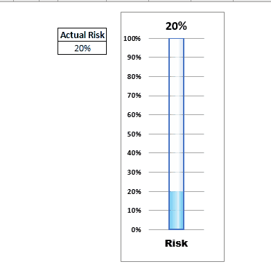
The thermometer chart is widely used in the corporate sector to represent financial and analytical data in Excel dashboards and PowerPoint presentations. But most of them use a simple thermometer chart that just fills up the vertical bar to represent data.
This chart goes one step ahead and changes the color of the fill to visually deliver the information. For example, you can set the colors of the fills to represent a specific value.
In the gif above, the blue fill shows that data is less than 40%. You don't need to look at the data points in the chart. Orange color tells that data is under 70% and red fill tells that data has crossed 70% mark in thermometer.
This chart can be used to show multiple data points as we use clustered column chart of excel. You can create a chart that has multiple thermometers in it. But that will be a lot of work but it can be done.
If you want to learn how to create a thermometer chart in Excel that changes colors, click here.
Advantages:
This creative advanced excel chart delivers the information in one glance. The user does not need to concentrate on the chart to see if data has crossed some specific point. It's easy to create too.
Disadvantages:
There are barely any disadvantages of this chart but some may find it tricky to create this chart.
You can download the template of this creative advanced excel chart below.
Download Thermometer Chart/Graph

Speedometer or gauge chart is a popular graphing technique for showing the rate of something in excel. It looks visually stunning and it is easy to understand. In this chart we have a semi circle that represents the 100% of data. It is divided into smaller parts and colored to show equal intervals. The needle in the chart shows the current rate of growth/achievement.
This creative excel chart uses a combo of pie chart and doughnut chart. The gauge is made of a doughnut chart and the need is a pie chart. Confusing?
You can learn how to create this amazing gauge chart in excel here.
Advantages:
Looks cool on the dashboard. It is best to show the rate of anything.
Disadvantages:
This chart may mislead users if the data-point is not used. It is a little bit tricky to create. We need supporting cells and formulas to create this chart.
If you are in a hurry and want to directly use this chart in your excel dashboard or presentation, then download it below.
In project management we often use waterfall charts but that is too mainstream. The waterfall charts have their advantages but if you only need to show the timeline of the project and depict when a certain task or milestone is achieved, we can use this highly creative and simple to understand milestone chart.

The milestone chart can be created in Excel using line chart and some simple tricks.
In the chart above we are showing when a certain milestone is achieved by our website. As we update our table, the chart gets updated dynamically by date and achievement numbers. Amazing! right?
You can learn how to create this amazing advanced excel chart in Excel here.
Advantages:
This creative excel chart is best for showing milestone achievement. It is easy to create.
Disadvantages:
Needs supporting formulas to create this chart which some find a little bit confusing.
Download the template for this Creative Excel Chart below.
While working with the line charts in Excel, we get a need to insert a vertical line at a specific point to mark some achievement or obstacle. This can make your chart more elaborating to the management. Most of the time people draw a vertical line to statically highlight a data point in the excel line chart.
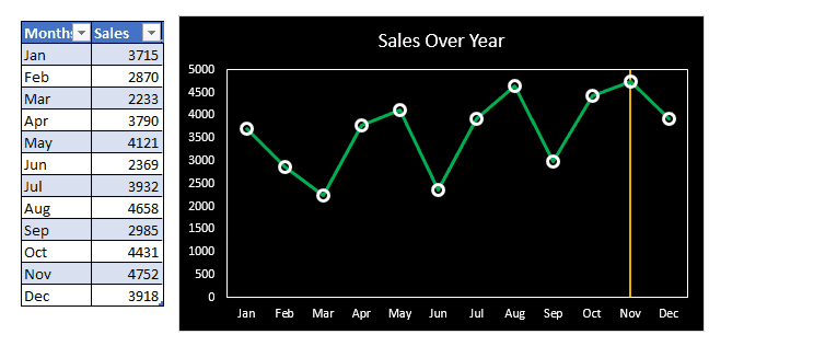
But this advanced excel chart uses a trick to dynamically insert a vertical line into a line chart. In the gif above, we insert the vertical line where the sales are largest. As the data changes the position of the vertical line also changes.
To learn how to create such an advanced excel chart, you can click here. You can download the template file below.
Advantages:
This chart easily inserts a break point at desired location dynamically. You can track the record before and after the inserted vertical line in the chart. It is easy to create.
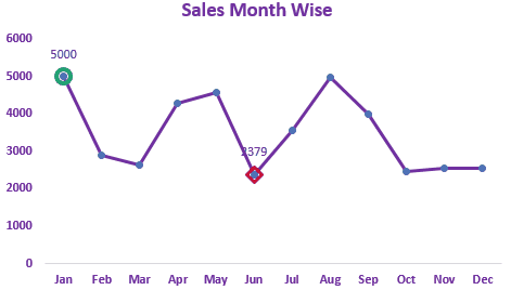

In this chart we try to do a simple task of highlighting the maximum and minimum data points.
We can highlight maximum and minimum data points in Excel Line and Bar Charts.
In the gif above, you can see the maximum values are highlighted using green color and the minimum value is highlighted using red color. Even if there are more than one maximum and minimum values then all of them are highlighted.
If you want to use this in your dashboards with your custom settings, you can learn how to create this advanced excel chart in minutes here.
Advantages:
This chart can easily highlight the maximum and minimum data points in the chart that most of the time management wants to know. You can configure this chart to highlight any specific data point by making some adjustments in the formula used.
You can use this chart immediately by downloading the template below:
![]()
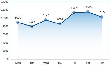
This chart is inspired by Google Analytics and aherfs visualization techniques. This is a simple line chart in excel. It does not show any extra information but it looks cool. This looks like a waterfall to me.
In this chart we use line chart and area chart. This chart can make your dashboard stand out in the presentation. It looks cool.
To learn how to add shade to a line chart in Excel you can click here.
Advantage:
This is a simple line chart but it looks cooler than the regular line chart of Excel.
Disadvantages:
This chart does not show any extra insight than a regular line chart.

This chart highlights the area in red where data points fall below average and highlights area with green when a data point goes above average.
In this chart we use line chart area chart together to get this creative chart.
In the chart above, you can see that as the data starts to go below average the chart highlights that area with red.
You can learn how to create this chart in Excel here.
Advantages:
It looks highly professional. It can make your dashboard stand out during the presentation.
Disadvantages:
It can mislead the information. You may need to explain it to others. And it takes some effort to create this chart rather than a simple line chart.
Download the template of the chart below:
![]()

This is similar to the chart above but more useful. In this advanced excel chart, we can creatively compare two series in line chart and tell when one is going above or below from another. This puts a show on the presentations. Whenever a series goes up the area is covered in green and when data points go down the area is covered in red.
You can use this chart to compare previous days, weeks, years, etc with each other. As in the above image, we are comparing the user visits of the last two weeks. We cab see that on Monday the week 2's users are greater than week 1's. On Tuesday, Week 2's data went down too much, down in comparison to week 1's data and that area is covered in red.
You can learn how to create this advanced chart in Excel here.
Advantages:
This chart is great when it comes to comparing two series. It is creative and accurate with data. It can charm your business dashboard.
Disadvantages:
This may confuse the first time users. You may need to explain this advanced excel chart to first-time users or panels.
You can download the excel chart template below:
![]() Highlight When Line Drops or Peaks
Highlight When Line Drops or Peaks
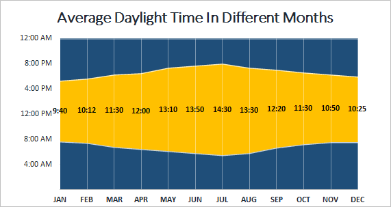
A sunrise/ sunset chart is commonly used by weather websites to show the daylight time in different days, weeks, months or years. We can create this type of advanced chart in Excel too.
This chart uses stacked area chart of Excel. We use some formulas and formatting to create this beautiful chart in Excel.
You can learn how to create this chart in Excel here.
Advantages:
This chart is a great tool for depicting average daylight time in a graphical way.
Disadvantages:
There's not much use of this chart. We can use this type of chart in specific types of data.
You need to understand the working of time in Excel.
You can download the template chart here:
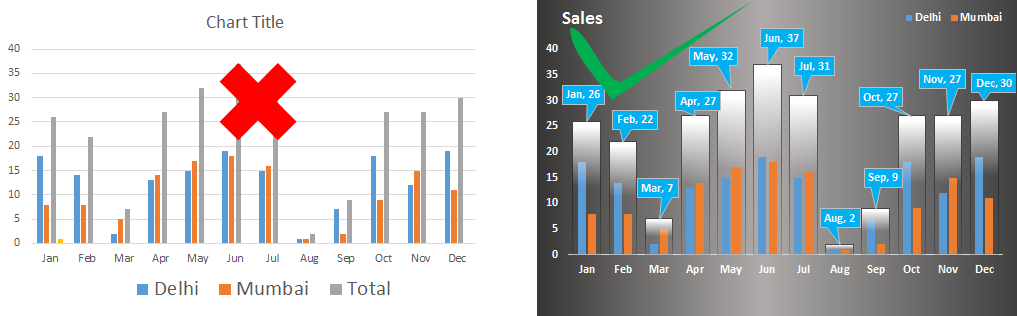 This is one of the most advanced Excel chart when it comes to clustered data representation. When you have multiple data series that you want to compare. You can compare the totals of the clusters to each other along with the series.
The total of the clusters is shown as a container of the clustered and they represent their value too. These containers can be compared to each other. You can compare the data-points inside these containers at same time in the same chart.
You can learn how to create this cool Excel Chart here.
Advantages:
This chart is easy to understand. Users can easily compare data series and make decisions. This column chart shows accurate data and there are less chances of misinterpretations.
Disadvantages:
It is a little bit tricky to create this chart in Excel. You will need to put in some effort to make it look good. You may need to explain it to the first time users.
You can download the template from below.
So yeah guys, these are some creative excel charts that you can use to make your dashboard tell more stories visually. You can use this chart in your presentations to make an impression in the front of the panel.
You can modify these charts as per your need to make new charts. If you play enough with these charts you might come up with your own chart types.I hope it was helpful to you and you like it. I have given sample files of the charts in this article. You can download them directly and use them on your excel dashboards. You can learn how to create these charts by clicking on the links available in the headings.
If you like these advanced charts, let me know in the comments section below. It will encourage me to get more creative charts for you. If you have any doubts regarding this article, let me know that too, in the comments section below.
Related Articles:
4 Creative Target Vs Achievement Charts in Excel : These four advanced excel charts can be used effectively to represent achievement vs target data. These charts are highly creative and self explanatory. The first chart looks like a swimming pool with swimmers. Take a look.
Best Charts in Excel and How To Use Them : These are some of the best charts that Excel provides. You should know how to use these chart and how they are interpreted. The line, column and pie chart are some common and but effective charts that have been used since the inception of the charts in excel. But Excel has more charts to explore...
Excel Sparklines : The Tiny Charts in Cell : These small charts reside in the cells of Excel. They are new to excel and not much explored. There are three types of Excel Sparkline charts in Excel. These 3 have sub categories, let's explore them.
Change Chart Data as Per Selected Cell : To change data as we select different cells we use worksheet events of Excel VBA. We change the data source of the chart as we change the selection or the cell. Here's how you do it.
Popular Articles:
50 Excel Shortcuts to Increase Your Productivity | Get faster at your task. These 50 shortcuts will make you work even faster on Excel.
How to use Excel VLOOKUP Function| This is one of the most used and popular functions of excel that is used to lookup value from different ranges and sheets.
How to use the Excel COUNTIF Function| Count values with conditions using this amazing function. You don't need to filter your data to count specific value. Countif function is essential to prepare your dashboard.
How to Use SUMIF Function in Excel | This is another dashboard essential function. This helps you sum up values on specific conditions.
The applications/code on this site are distributed as is and without warranties or liability. In no event shall the owner of the copyrights, or the authors of the applications/code be liable for any loss of profit, any problems or any damage resulting from the use or evaluation of the applications/code.


