
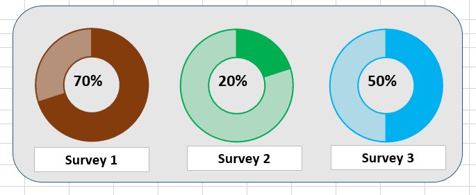
A progress bar is always a great way to visualize any kind of progress. It is easily digested by the management. If you can have an impressive progress bar in your presentation you can leave a good impression on your clients. But the regular progress bar is so mainstream. How about a dynamic circular fill-in progress infographic in Excel. Now that will be something impressive.
So, how do we create an advanced excel chart that shows the progress of the task in a circular Excel Chart? There are two main circular charts; Pie Chart, and Donut Chart. In this article, we will use the Donut Chart.
Let's say we are doing a survey and monitoring its completion. We have its completion percentage in Cell B3. The remaining percentage will, of course, be 1-B3. This is how we have it right now.
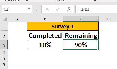
Cell B2 has the completed percentage and C2 has the remaining percentage. B2 can be coming from some calculations or hard code but C2 has the definite formula as
| =1-B2 |
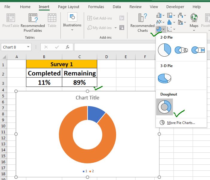
Step 1: Select B2:C2 and Insert a Donut Chart.
Creating a dynamic circular chart is quite easy than you think. Just select the data B2:C2 and go to:
Insert --> Charts --> Insert Donut Chart.
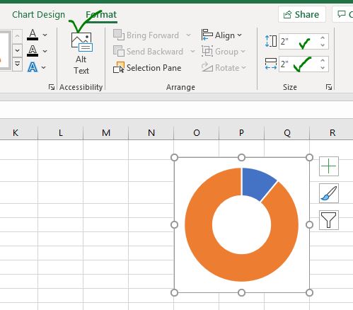
Step 2: Delete Non-required elements from the chart and adjust the width of the chart area.
Since we don't need the legends and chart titles yet, we delete them from the chart. Since our chart needs only the space of the circle, we reduce the width into a square shape. You can adjust the width and height of the chart from the format menu of the chart.
Step 3: Add Border to Donut Chart:
We need to add a border to the whole donut chart. Select the donut and right-click on it. Click on the "format data series" option. Go to fill and border --> Border --> solid line.

Step 4: Change the fill color to same color of the border.
While selecting the whole donut, go to fill option in formatting. Select solid fill. Choose the same color as the border. In this example, it is brown. Now it will look like a chocolate donut but you can't eat it.

Step 5: Reduce the Transparency of the Remaining part.
This step is very important. Double click on the remaining part and go to formating and reduce the transparency to 50%. This will make the chart look like a fill-in oval progress chart.

Practically, the chart is ready. If you want to use this chart as it is you can. But it is better to do some finishing to make the chart more readable and beautiful.
Step 6: Add Text Box in the Center of the Progress Chart.
Go to insert --> Text Box. Click on the text box option and add it to the center of the donut graph. Link it to the cell B3. To link, select the Text Box, click-in formula bar and give reference to cell B3

Now, whenever the completion of the process increases or decreases, it will be reflected on the chart, visually and numerically.
Step 7: Clear the background of the progress chart and make it no fill.
Select the chart area and go to fill in the formatting option. Select No fill for the chart area. For the border, select no border.
It will make the progress donut chart to look like a single independent object on the spreadsheet.

And the progress donut chart is ready to rock the presentation.

So yeah guys, this how you can create a circular progress chart in excel. You can make copies of it to display different types of information in Excel.
I hope it was explanatory and useful to you. Download the template file below. If you have any doubts or special requirements, mention it in the comments section below.
Related Articles:
Fragmented Circular Progress Chart in Excel | In this article, we will learn how to create a fragmented circular chart in excel. By fragments, I mean a circular chart (doughnut or pie) that is divided into equal parts and progress is shown by highlighting these fragments
How to Create Color Changing Thermometer Chart in Excel | You can have a normal bar chart to visualize information but how cool will it be if you can show it on a Thermometer like Excel Graph. Even cooler, if the chart changes color when the value of risk or goal increases or decreases.
How To Create Speedometer (Gauge) Chart in Excel | Excel Speedometer or Gauge graph is one of the most popular chart types that attract managers. It’s easy to understand. It visualizes achievement or growth rate creatively.
How to Create Milestone Chart in Excel | A milestone chart shows the date or time when a milestone achieved in a graphical way. This graph must be easy to read, Explanatory, and visually attractive.
Creative Column Chart that Includes Totals | To include the total of the clustered column in the chart and compare them with another group of the columns on the chart is not easy. Here, I have explained, how to smartly include totals in the clustered column chart.
4 Creative Target Vs Achievement Charts in Excel |Target vs Achievement charts is a very basic requirement of any excel dashboard. In monthly and yearly reports, Target Vs Achievement charts are the first charts the management refers too and a good target vs Achievement chart will surely grab the attention of management.
How to Highlight When Line Drops or Peaks in Comparison Excel Chart | To compare two series in Excel chart and highlight the low and peak areas, we can use this advanced excel chart.
Popular Articles:
50 Excel Shortcuts to Increase Your Productivity | Get faster at your task. These 50 shortcuts will make you work even faster on Excel.
How to Use The VLOOKUP Function in Excel | This is one of the most used and popular functions of excel that is used to lookup value from different ranges and sheets.
How to Use COUNTIF in Excel 2016 | Count values with conditions using this amazing function. You don't need to filter your data to count specific value. Countif function is essential to prepare your dashboard.
How to Use SUMIF Function in Excel | This is another dashboard essential function. This helps you sum up values on specific conditions.
The applications/code on this site are distributed as is and without warranties or liability. In no event shall the owner of the copyrights, or the authors of the applications/code be liable for any loss of profit, any problems or any damage resulting from the use or evaluation of the applications/code.


