
To visually see when the line on the chart is above or below the average of the series, we can simply insert an average line on the chart. It will look something like this.
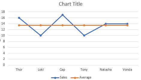
Is it attractive? Or this one?

I can guess your answer.
So how do we make this chart that highlights the area when the line is above or below the average? Let's learn it step by step.
The best way to learn is to learn by example. So let's start with an example.
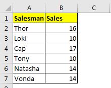
Here I have some data that tells the total sales done by individual salesmen. I want to visualize this data into a chart.
Step 1: Add Three helper columns
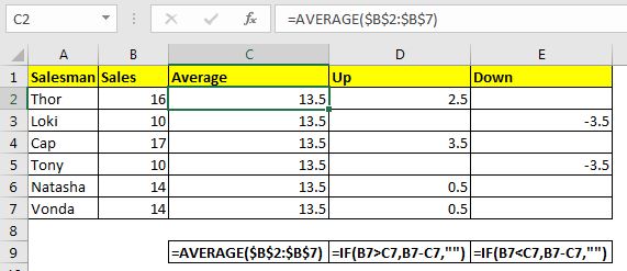
To make such a chart, we will need three helper columns. First helper columns will have average data. The second helper column will have all the points where sales are larger than the average. And the third column will have the points where the sales are less than the average.
So the formula in the average column will be:
| =AVERAGE($B$2:$B$7) |
Write this formula in the first cell of the average column and drag it down. Make sure that all the cells have the same values. We have used absolute referencing so that references don't change when formula copied down.
In the next column, we need all the UP values. It will be a positive difference between average and sales data. In other words, we need to subtract Average data from Sales only if Sales are greater than Average. The formula in D2 will be:
| =IF(B2>C2,B2-C2,"") |
Drag it down.
In the next column, we need all the Down values. It will be a negative difference between the average and sales data. In other words, we need to subtract Average data from Sales only if Sales is less than Average. The formula for E2 will be:
| =IF(B2<C2,B2-C2,"") |
Drag it down.
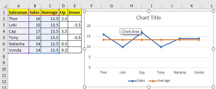
Step 2: Select Sales Adviser and Sales and Insert a Line Chart: In our example, we select the range A1:C7. Go to Insert--> Charts--> Line and Area --> Line with Markers. We have a chart that will look like this.
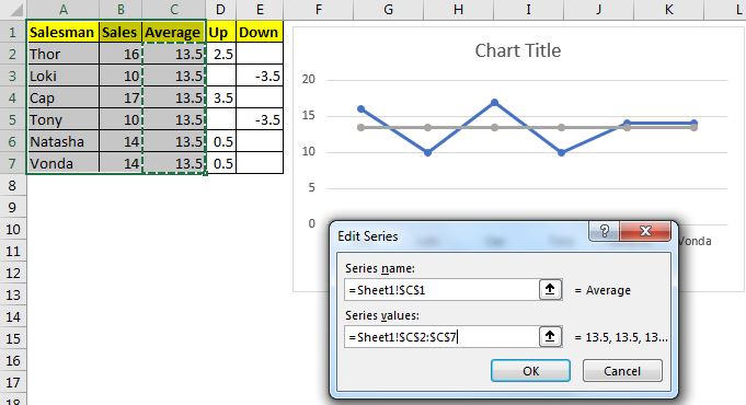
Step 3: Add Average Series one more time
Right-Click on the chart and click on the Select Data option. Here, click on the Add button in the Legend and Entries section. Select the average range C2:C7 as values of the series. It will insert a line on the original average line. We will need it in the formatting. It is important.
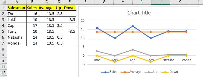
Step 4: Add Up and Down Series to the Data
As you added the average series again, similarly add the Up and Down series one by one to the series. Finally, you will have a chart that looks like this. this does not look anything like what we want it to be, right? Wait, it will evolve.
Step 5: Change Second Average Series, Up, and Down Series to Stacked Area Chart
Right-click on any series on the chart and click on the change Data Series Chart Type option. This will change the chart a lot and it will start taking a form that we want this excel line chart to be.

Step 6: Select No Fill for Average Area Stacked Chart:
Right-click on the area of average part and click on the format data series. In line with the fill option, go to fill and select no fill option.
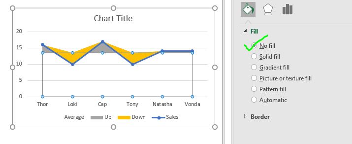
Now the chart looks exactly what we wanted it to look like. We just need to do a little bit of formatting to make it suit our dashboard/presentation theme.
Step 7: Format the chart to suit the theme.
Remove all the less required things from the chart. I removed the average legend from the chart since I don't need it. I removed the gridlines because I want my chart to look cleaner. I changed the color of the up area to green since and down the area to red. I named the chart title "Sales against Average".
Finally, I have this chart.
Note: This chart can be used as a target vs achievement chart. Just change the values of the average series to targets and boom, you will have the creative target vs achievement chart in Excel.
Down load the template file below:
![]()
So yeah guys, this how you can creatively use an excel line chart to highlight areas when a line goes below average or above average. I hope it is useful for you. If you have any doubts regarding this chart on any other excel/VBA related topic, ask in the comments section below.
Related Articles:
How to Add Shade to Curve Line in Excel Chart | In google analytics and other online tools, you must have seen line charts. In these charts, you can see the shaded area under the curves. This shading looks cool, isn't it? The question is, can we do this in Excel? How we can shade the area under the curve chart?
How to Highlight Maximum and Minimum Data Points in Excel Chart| Knowing the highest and lowest value in a data set is essential in almost all kind of reports. But in line and column Excel charts, it often gets difficult to identify, which value is highest and which value is lowest.
How to Insert A Dynamic Vertical Marker Line in Excel Line Chart | We can draw a vertical line on the chart manually but that just not smart. We would like to add vertical lines dynamically to mark a certain data point, say the max value.
How to Create Milestone Chart in Excel | A milestone chart shows the date or time when a milestone achieved in a graphical way. This graph must be easy to read, Explanatory, and visually attractive.
Waterfall Chart |This chart is also known as the flying bricks chart or as the bridge chart. It’s used for understanding how an initial value is affected by a series of intermediate positive or negative values.
Excel Sparklines: The Tiny Charts in Cell | The Sparklines are the small charts that reside in a single cell. Sparklines are used to show trends, improvement, and win-loss over the period. The sparklines are charts but they have limited functionalities as compared to regular charts.
Creative Column Chart that Includes Totals | To include the total of the clustered column in the chart and compare them with another group of the columns on the chart is not easy. Here, I have explained, how to smartly include totals in the clustered column chart.
4 Creative Target Vs Achievement Charts in Excel |Target vs Achievement charts is very basic requirement of any excel dashboard. In monthly and yearly reports, Target Vs Achievement charts are first charts the management refers too and a good target vs Achievement chart will surely grab the attention of management
Popular Articles:
50 Excel Shortcuts to Increase Your Productivity | Get faster at your task. These 50 shortcuts will make you work even faster on Excel.
How to Use The VLOOKUP Function in Excel | This is one of the most used and popular functions of excel that is used to lookup value from different ranges and sheets.
How to Use COUNTIF in Excel 2016 | Count values with conditions using this amazing function. You don't need to filter your data to count specific value. Countif function is essential to prepare your dashboard.
How to Use SUMIF Function in Excel | This is another dashboard essential function. This helps you sum up values on specific conditions.
The applications/code on this site are distributed as is and without warranties or liability. In no event shall the owner of the copyrights, or the authors of the applications/code be liable for any loss of profit, any problems or any damage resulting from the use or evaluation of the applications/code.


