

In this article, we will learn How to use shortcut keys to move charts in Excel.
Scenario:
In excel, Charts are the best way to visualize and analyze. But excel doesn't ask the user where to add the chart. Just when you click the insert chart, the chart shows up on the selected data. Now you have two options either to move the chart adjacent to the last value. Or move the chart to a new sheet. Let's learn how to do the same using excel options or keyboard shortcuts.
Move chart in Excel
There are two ways the above statements can be interpreted.
Move chart to another location in a worksheet
Here is the easiest and most common way to move charts and the first process works for both problems.
Move chart to another sheet
This is the most common problem an excel user has. Here is the easiest and most common way to move charts and the first process works for both problems.
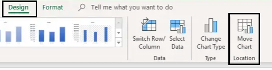
Go to Design and click the Move chart option as shown below.
This will open up a move chart dialog box. Select the New sheet and name Chart1. This option will open a new sheet named Chart1 with the chart.
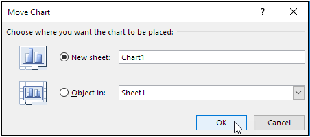
If you wish to move the chart to existing worksheet and select Object in and choose the sheet from the drop down list.
Here are all the observational notes using the formula in Excel
Notes :
Hope this article about How to use shortcut keys to move charts in Excel is explanatory. Find more articles on calculating values and related Excel formulas here. If you liked our blogs, share it with your friends on Facebook. And also you can follow us on Twitter and Facebook. We would love to hear from you, do let us know how we can improve, complement or innovate our work and make it better for you. Write to us at info@exceltip.com.
Related Articles :
Change Chart Data as Per Selected Cell : To change data as we select different cells we use worksheet events of Excel VBA. We change the data source of the chart as we change the selection or the cell. Here's how you do it.
Best Charts in Excel and How To Use Them : These are some of the best charts that Excel provides. You should know how to use these charts and how they are interpreted. The line, column and pie chart are some common and but effective charts that have been used since the inception of the charts in excel. But Excel has more charts to explore.
How to use Stacked Column Chart in Excel : The stacked column chart is best for comparing data within the group. The column chart is oriented vertically.
4 Creative Target Vs Achievement Charts in Excel : These four advanced excel charts can be used effectively to represent achievement vs target data. These charts are highly creative and self explanatory. The first chart looks like a swimming pool with swimmers. Take a look.
Perform Clustered Column Chart in Excel : The clustered column chart is a column chart that visualizes the magnitude of data using vertical bars. Compare two variables using the Clustered Column Chart.
Popular Articles :
10+ Creative Advanced Excel Charts to Rock Your Dashboard : These creative charts can make you stand apart from the crowd. These charts can be used for different types of reports. Your dashboard will be more expressive than ever.
How to use the VLOOKUP Function in Excel : This is one of the most used and popular functions of excel that is used to lookup value from different ranges and sheets.
How to use the IF Function in Excel : The IF statement in Excel checks the condition and returns a specific value if the condition is TRUE or returns another specific value if FALSE.
How to use the SUMIF Function in Excel : This is another dashboard essential function. This helps you sum up values on specific conditions.
How to use the COUNTIF Function in Excel : Count values with conditions using this amazing function. You don't need to filter your data to count specific values. Countif function is essential to prepare your dashboard.
The applications/code on this site are distributed as is and without warranties or liability. In no event shall the owner of the copyrights, or the authors of the applications/code be liable for any loss of profit, any problems or any damage resulting from the use or evaluation of the applications/code.


