

In this article, we will learn How to Create a Chart or a Graph in Microsoft Excel.
What is a Chart or a Graph ?
Pictorial representation of Mathematical values is called a graph in mathematics and it is achieved using Charts in Excel. Imagining a small data set of 10 rows having viewers of a website page. You can view the ups and downs of these trends and variation numerically. But if the data s of 1000 rows, then it's not possible to see trends and variation. Human mind can interpret more information from a graph or a chart rather than numerical values.
Types of chart available in Excel
Example :
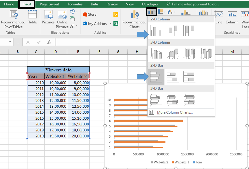
All of these might be confusing to understand. Let's understand how to demonstrate data in a clustered bar chart in Excel. Here we have data where we need to compare the viewers of two websites on a year wise basis in a clustered 2D chart.

Select the data as shown in the above image. Go to Insert -> Now select any clustered chart (bar or column) as indicated arrows in the below image.
You will get a chart having a chart representing 3 datasets with indices 1 to 10 in the vertical axis. We need a chart representing two datasets on a year basis. But here the bars represent the year, website 1 viewer, website 2 viewer in chart selected.

Now follow the steps that will guide you to edit this chart to the type of chart required. First problem is the little blue bars in the chart and the vertical axis representing years data.
Right click on chart and click Select data option as shown below.

Clicking the option will display a Select Data Source dialog box. This box shows the data represented on the bars on the left and horizontal axis indices on the right.
First we need to remove the third type of bars which is years.

Select the Year from the Bars and click the Remove button to remove it. This will remove the little blue bars from the chart as shown below.

As you can see now there are only two datasets as bars. Now we will edit the indices with year values. Select the Edit button.

Clicking the Edit button as shown in the above image will open a Axis labels box asking for the new range to replace with indices. Select the year range from the data as shown in the image below.

As you fill the Axis Label Range by selecting the year fields from the data, the chart behind it gets updated. Now click OK to get it confirmed.

As you can see the required chart is here. Now we will give it some finishing to make it look presentable.
First we will edit the horizontal axis. By double clicking the axis, it will open a Format axis panel in the right of the chart as shown below.

Here The chart shows the minimum and maximum bounds which are set by default in Excel charts. The chart
is expanded by changing these bounds. For the range to be shown in millions. Select the Display units to millions from None. Display unit option will be under the Format axis option below the Bounds option we just used.

The viewer bars are presented in the millions. The chart looks presentable now.
Now edit the Bars Width and gap Width between the bars by fixing the Series Overlap and Gap Width percentage as shown below.

And select the Primary Axis option from the Series Options. Edit the second bar if required. As you can see the Bars Width and Gap Width are adjusted according to chart size.
Here are some observations which are useful using the chart explained above.
Notes :
Edit the format of the axis in a chart. Open Format Axis -> Number and edit it the same way, we edit the cell in Excel as shown below.

Hope this article about How to Create a Chart or a Graph in Microsoft Excel is explanatory. Find more articles on different types of charts and their corresponding advanced charts option here. If you liked our blogs, share it with your friends on Facebook. And also you can follow us on Twitter and Facebook. We would love to hear from you, do let us know how we can improve, complement or innovate our work and make it better for you. Write us at info@exceltip.com
Related Articles :
Best Charts in Excel and How To Use Them : These are some of the best charts that Excel provides. The line, column and pie chart are some common and but effective charts that have been used since the inception of the charts in excel.
How to use Stacked Column Chart in Excel : The stacked column chart is best for comparing data within the group. The column chart is oriented vertically.
Perform Clustered Column Chart in Excel : The clustered column chart is a column chart that visualizes the magnitude of data using vertical bars. Compare two variables using the Clustered Column Chart.
10+ Creative Advanced Excel Charts to Rock Your Dashboard : These creative charts can make you stand apart from the crowd. These charts can be used for different types of reports. Your dashboard will be more expressive than ever.
Popular Articles :
How to use the IF Function in Excel : The IF statement in Excel checks the condition and returns a specific value if the condition is TRUE or returns another specific value if FALSE.
How to use the VLOOKUP Function in Excel : This is one of the most used and popular functions of excel that is used to lookup value from different ranges and sheets.
How to use the SUMIF Function in Excel : This is another dashboard essential function. This helps you sum up values on specific conditions.
How to use the COUNTIF Function in Excel : Count values with conditions using this amazing function. You don't need to filter your data to count specific values. Countif function is essential to prepare your dashboard.
The applications/code on this site are distributed as is and without warranties or liability. In no event shall the owner of the copyrights, or the authors of the applications/code be liable for any loss of profit, any problems or any damage resulting from the use or evaluation of the applications/code.


