
Area chart in Excel is a colorful chart that has the power to show and distinguish the various data in a more distinct display. It’s a discreet presentation, so as to make representations to clients more understandable and acceptable with full marks.
Area chart contains 2 type of visualization and 3 type of charts-
2D Area and 3D Area :-
1) Area Chart
2) Stacked Chart
3) 100% Stacked Chart
More about Area Charts
Area charts look similar to line charts, but the only difference is that in area charts the areas below the lines are displayed in one particular color. Hence, it is easier to understand the different zones of areas so that you learn things better. It can be said that the data series that have lesser values are hidden behind the block of data series which have higher values. Hence, it shows which series have more preference and should appear in the front.
Microsoft Office Excel 2007 and later is the right choice when applying area charts. Since this operating systems helps in making charts in excel especially area charts in Excel with more distinctions therefore the charts appear transparent.
Plotting data in the various Excel data charts is not so complicated task if you know the procedures. You can make a chart in Excel if you know how to do it, since the whole thing follows a few simple procedures. You will find data arranged in columns and rows on the various worksheets. With area charts you realize the magnitude of variation. If you want to emphasize profit in a certain period of time, then you can use area charts for the same.
Excel charts and graphs follow the same processes. Let’s take an example to understand how to create the Area chart.
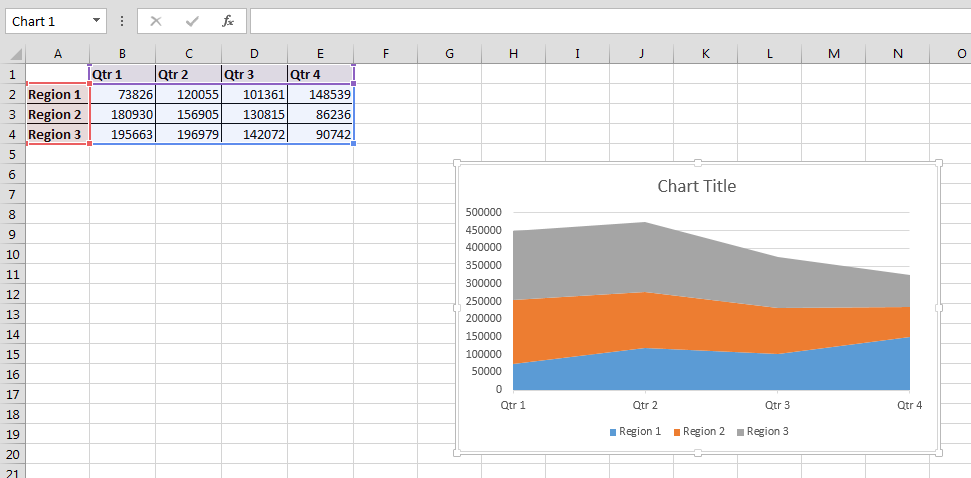
We have region wise quarterly sales data.

Follow below given steps to create Area chart:-

Remember, there are different chart types in Excel and they are bar, column, line, pie, Doughnut, radar, XY, area, bubble, stock, cylinder and much more. Hence it can be said that if you know how to create charts and graphs in Excel then presentation becomes easy and less complicated.
![]()
If you liked our blogs, share it with your friends on Facebook. And also you can follow us on Twitter and Facebook.
We would love to hear from you, do let us know how we can improve, complement or innovate our work and make it better for you. Write us at info@exceltip.com
The applications/code on this site are distributed as is and without warranties or liability. In no event shall the owner of the copyrights, or the authors of the applications/code be liable for any loss of profit, any problems or any damage resulting from the use or evaluation of the applications/code.


