About Dashboard:
Sales performance dashboard is useful to analyze the performance of sales. By using the sales performance dashboard we can see the individual performance and make improvement in the performance on the basis of data, it will help us to forecast the next vision of targets and achievement and managing the things like how we can improve the sales and how we can generate the revenue etc.
Every company has a product they need to sale it to increase the business and to return the expenditures of company. So sales is played very important role to increase the business and that is why we had to focus on their performance. Ultimately when sales will improve the company will grow.
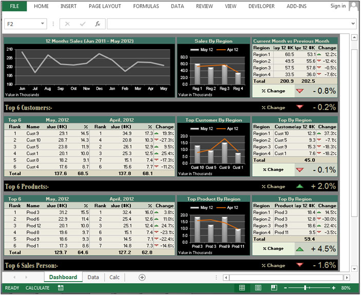
Below shown dashboard is useful to analyses sales performance in the every field.

Chart:-Monthly Sales

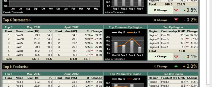
Line chart used to show the value of sales month wise. In July’2012 generated high sales to other months.
Line with Column chart used to show the Region wise sales performance in two months. We can see that Region 1 had good performance in both months.
In the table shown the sales performance region wise for current month Vs previous month. We can see that % change is in negative, so according to this report can improve as require.
Chart:- Top 6 Customers

In the above table prepared the report about the customer’s Values and %age of contribution in between 2 months. Through this report we can analyze that Customer 9 performed good in both of months.
Line and column chart used to display the customer performance in between 2 months.
In the table shown the customer performance region wise for current month Vs previous month. We can see that % change is in negative, so according to this report can improve as require.
Chart:- Product Performance

In the above table prepared the report about the product Values and %age of contribution in between 2 months. Through this report we can analyze that Product 3 performed good in both of months.
Line and column chart used to display the Product performance in between 2 months.
In the table shown the customer performance region wise for current month Vs previous month. We can see that % change is in positive.
Chart:- Sales Person

In the above table prepared the report about the sales person’s sales Values and %age of contribution in between 2 months. Through this report we can analyze that sales person 4 performed good in both of months.
Line and column chart used to display the Person performance in between 2 months.
In the table shown the customer performance region wise for current month Vs previous month. We can see that % change is in negative, so according to this report can improve as require.
![]()
If you liked our blogs, share it with your friends on Facebook. And also you can follow us on Twitter and Facebook.
We would love to hear from you, do let us know how we can improve, complement or innovate our work and make it better for you. Write us at info@exceltip.com
The applications/code on this site are distributed as is and without warranties or liability. In no event shall the owner of the copyrights, or the authors of the applications/code be liable for any loss of profit, any problems or any damage resulting from the use or evaluation of the applications/code.
Amazing dashboard Haseeb. It is very rare to have such a talent. Keep up your talent, I'll be following you 🙂
I am a lazy person. It is very rare to have such a talent. When I see this dashbaord, I feel I was wasting my time with nothing. I should have been learn something. I am going to learn.....
What a beautifull dashboard. Thanks for site admin to share such a beutyful file.
Beautiful dashboard. I feel jealous on his talent 🙂
Nice one. Haseeb A, If you are willing for paid service, let me know.
Awesome dashboard. Thanks for sharing.
Thanks David for the appreciation. 🙂
Beautiful dashboard. Clean & genuine. Thanks for site owner's to sharing Haseeb A's effort.
Thanks Julia for the appreciation. 🙂
Excellent blog.
Awesome dashboard Mr. Haseeb. Me & friends printed this dashboard in our office lazer printer. What an amazing look. Looks like a fashion magazine print. Keep up your colour sense Haseeb.
Hi Deepa,
Thanks for visiting us and appreciation! 🙂
Regards,
Site Admin
What a beauty Haseeb. Thanks for sharing such a beauty.
One of the amazing daahboard I ever seen. Nice work Haseeb
Hi Priya,
Thanks for the appreciation. 🙂
Regards,
Site Admin
Amazng
Awesome work Haseeb. I want to be like you.
Hi Lal Krishna,
Thanks for the appreciation. 🙂
Regards,
Site Admin
What an awesome work Haseeb. I have found your somany professional solutions in the forums.
I was trying to be a hero in my company with your file. I submitted your file with our data to my manager. But after 10 miunutes she called & told me. I had seen this dashboard somewhere, so i searched google and found the original. She added, "I am also a member on this community, so I know very well about Haseeb & his talent". I felt very shame. But hats off to your talent haseeb. I googled your name and found somany awesome solutions. Thanks for your file.
I was thought Excel has very limited in such reporting. I thought this will require a professional software. But when I saw your dashboard I changed my thought.
Hi Haseeb,
What an excellent dashboard. Thank you for your time. When I printed this dashboard, it looks like high class magazine. Colors & layout are awesome.
I was going through this dashboard & this is still amazing me...!
Hello Haseeb,
What an awesome dashboard is this. You color sense is marvelous. An absolutely fantastic dashboard. Anybody can follow & understand your dashboard.
% of change is awesome.
% of change is awesome. What a beauty is this!
Looks like an amazing chart. Fantastic presentation with nice colors. How can I download it. Hey site admin please provide a link to download this beautiful dashboard.
Hallo,
this looks awsome. May I have the link to download it. That would be nice. Thanks in advance.
Is this dashboard available to download? It really is fantastic looking.
Any chance of getting a download of Haseeb A's excellent looking sales performance dashboard?
would love to get a download of this dashboard
Looks like good work. Simple dashboard with nice colors. Rank is awesome...! How can I download? Where is the link?
Download?
Most Excellent Chart. Covers everything