About Dashboard:
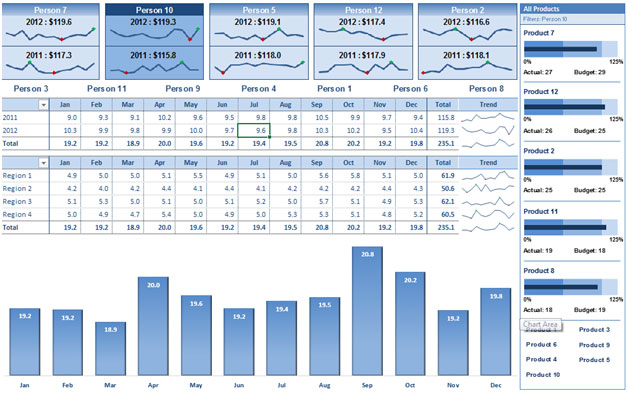
This dashboard shows company’s sales by salesperson, product, region and month-wise.
There are several ways in which you can visualize sales data to understand the market trends and sales performance. In October, Excel Forum team launched a dashboard, competing in which you are asked to visualize sales data using sample data. The challenge has generated a huge thrill around the community and fetched 118 incredible entries.
Thanks everyone for participating and making this a huge learning experience for everyone. Excel Forum team has learned several useful dashboard and charting tricks.
In this article, we will show you the steps on how to create this dashboard.
Let us see how the Dashboard made by Daniel Don looks:

We have divided this dashboard into 5 sections of information. Let us take a look at each one separately.
Section1:
In this dashboard, “Clear All Filters is our friend” as multiple filters are applied to make the dashboard interactive. On the top right-hand side, there is a textbox set & small macro is aligned so that whenever you click on the dashboard,it will take you to its original settings.

Section2:
The below snapshot will help us in understanding the sales done by Person in both years, 2011 & 2012 using sparklines.

If you click any one of them then all the corresponding sales done will get dynamically updated like product, region & month-wise.Let us see how the data updates, say, we click on Person 10.

Section3:
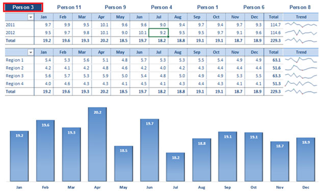
There is another way to show a salesperson’s corresponding data gets updated.If we click on any person then it will show the sales done by that person, product & region.
![]()
If we click on Person 3, then the person will get highlighted &the below pivot table, chart, trend & product information gets updated.

The Person 3 sales data got updated as we click & the viewer will get information about the product actual v budget in percentage.

Section4:
We can filter down by year if we click on the dropdown or region & pivot table will be updated automatically.


If we select year 2012 then we will be able to view the report for that particular year month-wise.

If we select Region 2 then we will be able to view the report for corresponding region month-wise.

Section5:
If we click on any product, it will get highlighted & we can show the product contribution in sales data.

Using this dashboard we can get a clear view of the Sales industry and thus we can get the information from various points of view.
Download Dashboard
The applications/code on this site are distributed as is and without warranties or liability. In no event shall the owner of the copyrights, or the authors of the applications/code be liable for any loss of profit, any problems or any damage resulting from the use or evaluation of the applications/code.
Enjoying the extra ordinary presentation given by the help of informative flow charts, A debt of gratitude is order of sharing !!