

About Dashboard:
This dashboard showscompany’s salesby region, year, team member and customer.
There are 9 charts in this dashboard, and in this way, we cantrack conversion rate on the basis ofteam, also, you’ll be able to identify the strengths and weaknesses in the sales process. The motive of this dashboard is to show the sales credibility& management visibility.
There are several ways in which you can visualize sales data in order to understand the market trends and sales performance. In the month of October, ExcelForum teamhas launched a dashboard competing in which you are asked to visualize data using sample data. The challenge has generated a huge thrill around the community and has fetched 118 incredible entries.
Thanks everyone for participating and making it a greatlearning experience for everyone. ExcelForum team has learned several useful dashboard and charting tricks.
In this article, we will show you the steps to create this dashboard.
Let us see how the Dashboard made by TxCPAlooks:


We have divided this dashboard into 8 sections of information. Let us take a look at each one separately.
Section1:
The picture below provides overall company sales on yearly and monthly basis, using line chart. Using the line chart, we can easily compare the sales performance, month wise.
This section details the sales performance by region.

Section2:
The snapshot belowis a line chart with markers showing sales performance for region, month wise. There is a drop down listthat shows the cumulative sales for a selected region.

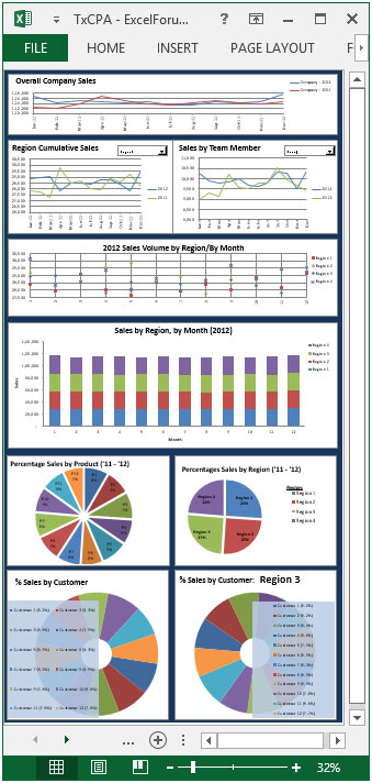
Section3:
The following picture shows the monthly sales performance of the team memberfor the year 2013 and 2014. There is adropdown list whichis used to provide dynamicfunctionality.
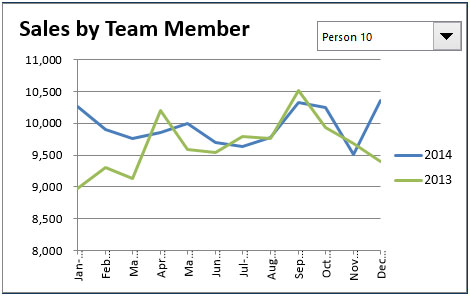
Section4:
This section shows sales volume for the year 2012 by region & month.
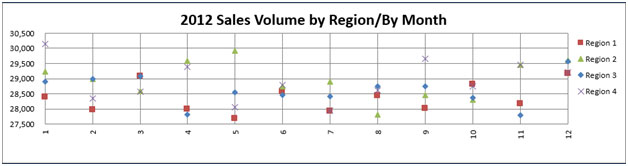
Section5:
The picture below shows the month-wise sales by region for the year 2012.
Section6:
This section provides sales report by product for the session 2011-2012, in percentage.

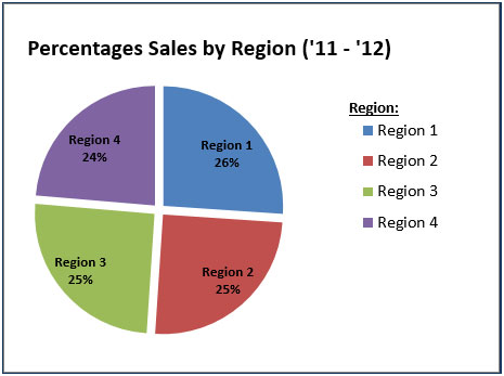
Section7:
This section provides sales by region for the session 2011-2012, in percentage.
Section8:
The following picture covers information regarding customer sales, in percentage.

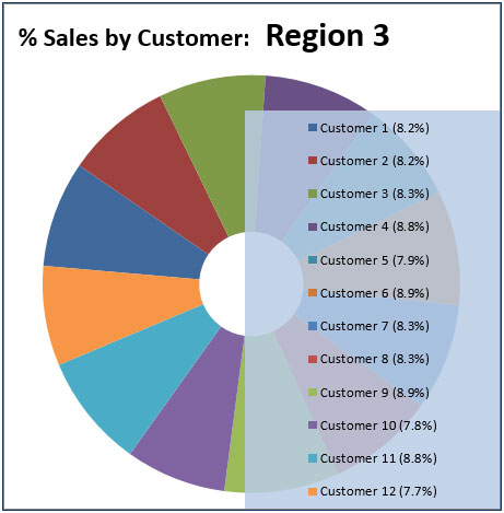
Section 9:
The following picture covers information of sales considering the customer for a selected region, in percentage.
Using this dashboard, you can get a clear view of the Sales industry and the information from various points of view.
Download Dashboard
The applications/code on this site are distributed as is and without warranties or liability. In no event shall the owner of the copyrights, or the authors of the applications/code be liable for any loss of profit, any problems or any damage resulting from the use or evaluation of the applications/code.


fantustic
http://whatshacker.net
find coll stuff with an updated version of whatsapp for boundless activity without paying any charges.