
About Dashboard:
This dashboard showscompany’s financial summaryon industry estimated Vs. actual revenue, revenue by region, revenue by product, revenue by industries, yearly analysis.
This review is for business owner who needs an intuitive financial dashboard on a daily basis, but more so, needs the ability to forecast and run scenarios to grow a company.
In today’s world there is a huge pressure on the management to provide faster and transparent information which helps in determining company’soverall performance. It tracks financial datawhich helps to see the growth from various perspective of the industry.
There are several ways in which you can visualize financial data to understand the company’s goal. In October month, Excelforumteamhas launched a dashboard competing in which you are asked to visualize financial data using sample data. The challenge has generated a huge thrill around the community and fetched 118 incredible entries.
In this article, we will show you the steps on how to create this dashboard
Let us see the how Dashboard made by Michael Grohs looks:

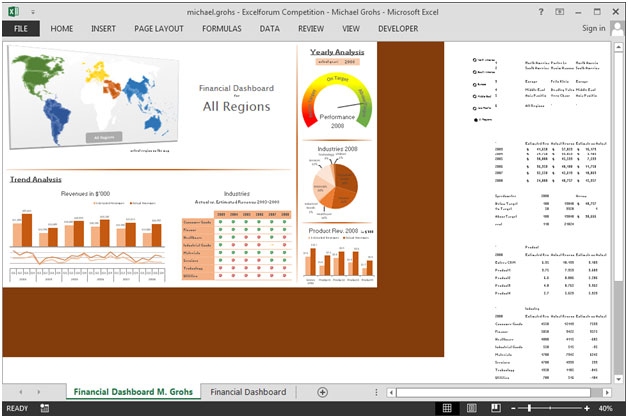
We have divided this dashboard into 6 sections of information. Let us take a look at each one separately.
Section1:
In this section,we can click on any region & the related information gets updated in the whole dashboard.
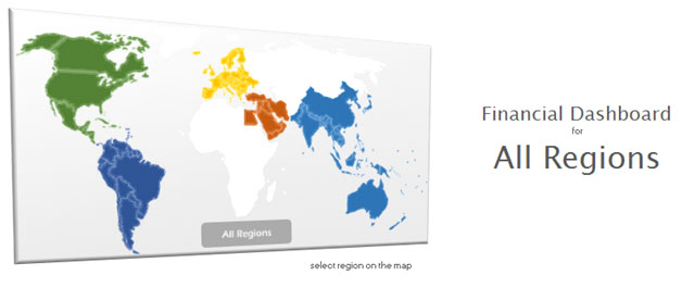
If we select middle region then the middle region in map will be highlighted refer below snapshot:

This is very cool feature of this dashboard which provides interactivity.
Section2:
This section covers information related to Yearly analysis on target achieved or not. We can use the drop down list to select the year for which the performance will get updated.
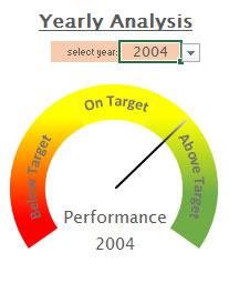
Section3:
This section covers Industries revenue share in percentage using pie chart. We can use the drop down list to select the year for which the performance will get updated dynamically.

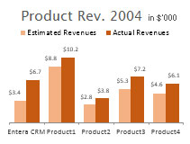
Section 4:
This section covers Product revenue in ($’000) for est. rev & act rev. We can use the drop down list to select the year for which the performance will get updated dynamically.
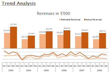
The following chart shows trend analysis of Revenue in ($’000) for estimated revenue & actual revenue shown using column & line charts for all the years.
Section 6:
The following chart shows trend analysis of Industries estimated revenue & actual revenue shown using column & line charts for all the years.
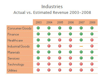
The green balls represent actual revenue is higher than estimated revenue while red ball shows the actual revenue is lower than the estimated revenue.
Using this dashboard you can get a clear view of the financial industry and we can get the information from various point of view.
![]()
If you liked our blogs, share it with your friends on Facebook. And also you can follow us on Twitter and Facebook.
We would love to hear from you, do let us know how we can improve, complement or innovate our work and make it better for you. Write us at info@exceltip.com
The applications/code on this site are distributed as is and without warranties or liability. In no event shall the owner of the copyrights, or the authors of the applications/code be liable for any loss of profit, any problems or any damage resulting from the use or evaluation of the applications/code.


This program is related to my working, so should you train us how to do it ? Many thanks.
would love a copy of this to play around with. Thx.
May I please have a copy of this great work of yours?
Very nice! can you please send on my email.
Hello,
Can you please provide me your dashboard, I'd like to take a look and also provide you some comments.
Thanks,
Great Work Done. May I Get the copy on aneesk@gmail.com
hi, can you please send on my email.
What a great dashboard. I too would love a download link to this to study it in more detail. Great job, it inspires me to learn more about Excel
Hi - great dashboard. Could I get a copy on luiz.fellipe@outlook.com to see in further details?
Very nice! I'dd like to download this file, can you send me the link also? Thanks in advance.
Very nice! Can you please send me a link to download this file also? Thanks in advance!
Thank you for this work! Can we have a download link?
Excellent work ! You are very good. Can you send a link to download this file ? Thank you very much !
This is excellent! ExcelTip Team, please can you post the link to download? Much appreciated.
Hi!
Congratulations for this amazing work.
Could be possible to download this dashboard?
Thanks in advance!