
About Dashboard:
This dashboard shows company’s financial summary on industry estimated vs. actual revenue, revenue by region, estimated revenue.
This review is for the business owner who needs an intuitive financial dashboard on a daily basis, but more so, needs the ability to forecast and run scenarios to grow a company.
In today’s world, there is a huge pressure on the management to provide faster and transparent information, which helps in determining company’s overall performance. It tracks financial data, which helps to see the growth from various perspective of the industry.
There are several ways in which you can visualize financial data to understand the company’s goal. In October, Excel Forum team launched a dashboard, competing in which you are asked to visualize financial data using sample data. The challenge has generated a huge thrill around the community and fetched 118 incredible entries.
Thanks everyone for participating and making this a huge learning experience for everyone. Excel Forum team has learned several useful dashboard and charting tricks.
In this article, we will show you the steps on how to create this dashboard.
Let us see how the Dashboard made by Mkulp looks:

We have divided this dashboard into 4 sections of information. Let us take a look at each one separately.
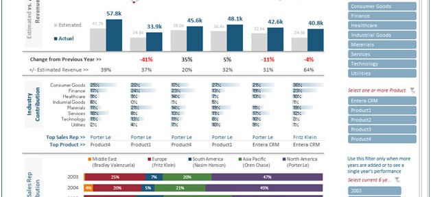
Section1:
In this dashboard,you will get estimated vs. actual revenue by yearly.

The change from the previous year is calculated & shown in percentage.
Section2:
This section covers information related to Industry contribution region-wise.
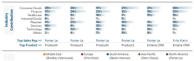
The top product & sales rep is shown for each industry.
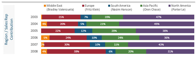
Section3:
The below picture is showing Region/Sales Rep Contribution, yearly in percentage through chart.
Section 4:
This section covers the right pane of the screen, which is controlled through slicer.
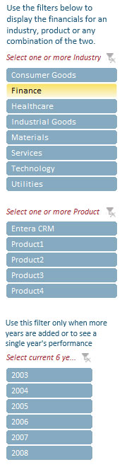
The slicers are filtered according to Industry, Product & year. If we select any particular industry with product & year combination then all the data will be accordinglyupdated.
Using this dashboard we can get a clear view of the financial industry and thus we can get the information from various points of view.
The applications/code on this site are distributed as is and without warranties or liability. In no event shall the owner of the copyrights, or the authors of the applications/code be liable for any loss of profit, any problems or any damage resulting from the use or evaluation of the applications/code.


Excellent
This was nice and impressive post thank you so much for sharing this type of info with us you are doing the awesome work. This site is very amazing they do my work and it's really well.
Things are very open and intensely clear explanation of issues. Was truly information. Your website is very beneficial. Appreciate your sharing.
This should have been the winner or at least among the first ones. Great design, visualization and choice of colours. No pie charts. Excellent
Great job!!!
Great Job Melissa, just like you, your dashboard looks beautiful.