
About Dashboard:
This dashboard showsShift Handover Report of a company. With this dashboard we can quickly analyze the performance of all the associated lines.
There is performance shown on various scales for 4 days at one point of time. Using this dashboard we can easily compare the performance with various parameters like plan, cost, efficiency, etc.
There are several ways in which you can visualize data to understand the company’s goal. In October month, Excel forum team has launched a dashboard competing in which you are asked to visualize data using sample data. The challenge has generated a huge thrill around the community and fetched 118 incredible entries.
In this article, we will show you the steps on how to create this dashboard.
Let us see the how Dashboard made by Johnny247 looks:
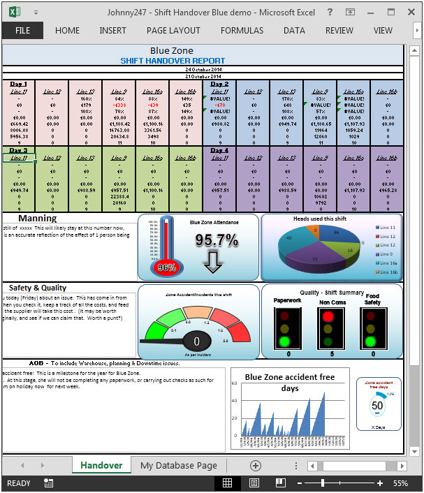
We have divided this dashboard into 6 sections of information. Let us take a look at each one separately.
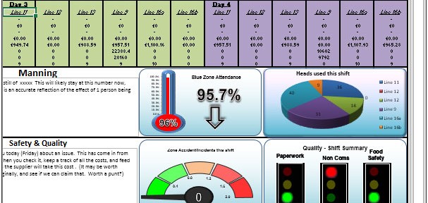
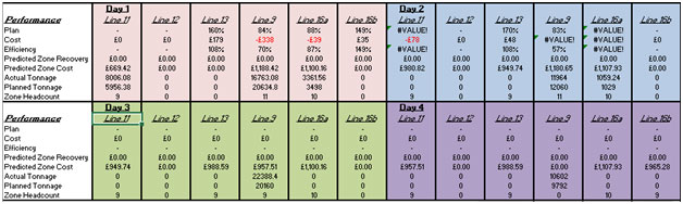
Section1:
In this section,performance from day 1 to 4 are shown on following parameters:
Plan, Cost, Efficiency, Predicted Zone Recovery, Predicted Zone cost, Actual Tonnage, Planned Tonnage, Zone Headcount.
Section2:
This section covers information on Attendance.

Section3:
This section shows Head count used in this shift. The graph is shown using pie chart for all the lines.

Section 4:
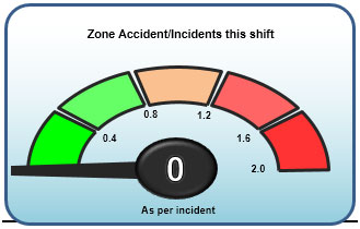
This section zone accident per incidents this shift.
Section 5:
The following is a quality shift summary chart shows different parameters like paperwork, non coms, food safety.
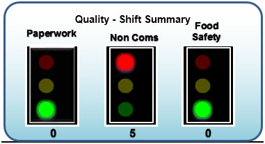
In the above picture, paperwork & food safety are in green color while non coms is in red color.
Section 6:
This section shows blue zone accident free days

There are only 50 days in which there is no accident occurs, the same information is shown in above chart in percentage.
Using this dashboard you can get a clear view of the industry and we can get the information from various point of view.
![]()
If you liked our blogs, share it with your friends on Facebook. And also you can follow us on Twitter and Facebook.
We would love to hear from you, do let us know how we can improve, complement or innovate our work and make it better for you. Write us at info@exceltip.com
The applications/code on this site are distributed as is and without warranties or liability. In no event shall the owner of the copyrights, or the authors of the applications/code be liable for any loss of profit, any problems or any damage resulting from the use or evaluation of the applications/code.


Excellent
Hi Johnny Its an excellent dashboard. Kudos to you.
Can you send me the downlaod link
Hi,
Can you please email me your dashboard. I think it is great but without looking I can't really provide much comments
Nice work. Can you send me the file or the link to download it.
Thank you in advance.
Gerry
I really like the look of this dashboard. Could you send me the download link as well?
Great Work I would like to download this dashboard
Can you send me the link to download?
Great dashboard, may I get it?
Thanks
Great dashboard, is it possible to receive a link to download this dashboard?
Thanks in advance.
Great dashboard, love the graphic aspects and would love to see how its done - can you send the download link pleasae
Can you send me the link to download?
From your blog it seems that you are en expert of writing article. Your contents are amazing and facts are true. I agree to all of your points that you have mentioned.
emmrautoauction.org |
Awesome. Please send download link
Extremely well presented! I am wondering if the needle in section 4 - zone accidents - actually moves (and how, calculation behind it)?. Also in section 2, I am assuming the red dot and 96% are one graphic and the red bar is another graph, correct? How can I get more info?
Can you send me the link to download?
Could you please send me a link also? Thanks
If possible, I'd like a link to download as well....Would really like to know/learn how those stoplights work in your program.
i really liked this feature.could you please send me the link to download this dashboard.so that i can also create something like this.
Thank,
Anand
Excellent ! Can you send a link to download this file ? Thank you very much.
I love this information. I am an excel and access aficionado. Love to see more of these emails. Mary Ann