 I always emphasize on having a creative charts in Excel dashboards and Powerpoint presentations as I know the power of an attractive and easy to understand infographic. An effective chart like this male female infographic can get you a project, promotion and reputation. Most of the time Excel users take it to the powerpoint to create a static male female chart. But we can create this great infographic in excel without taking the help of powerpoint. Let's learn how?
We have a data of voting % by gender. We need to create an Excel chart that uses Male-Female icon and fill them to represent voting percentage.

The cells B3 and C3 have actual voting percentage of Male and Female. The cells B4 and C4 have 100%. This will be needed to create the male female icons. Now follow these steps.
Step 1: Insert a Clustered Column Chart for the Data
Select the range A2:C4. Go to Insert menu. Go to charts --> Column Charts --> Clustered Column Charts.

Step 2: Insert a Male PNG Symbol
In Excel 365 and 2019, Excel provides inbuilt icons that have male female icons. But in older versions, Excel does not have this feature. I am using Excel 2016 to create this infographic chart so that everyone can use this tutorial.
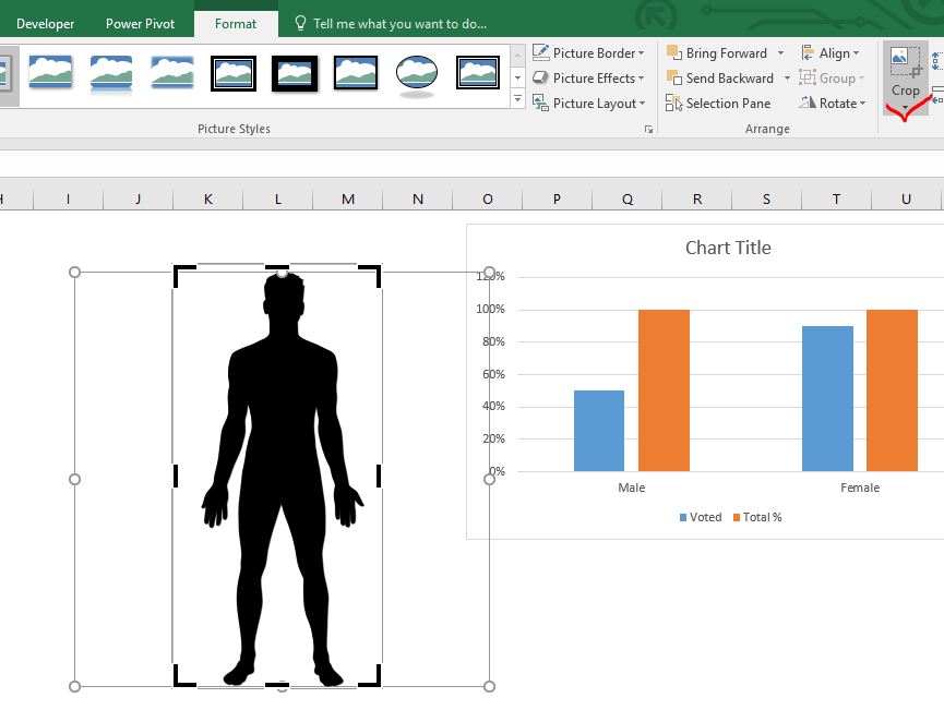
Now insert Male png in Excel sheet. You can search on the internet and copy it in excel. Make sure it is a PNG file without background.

Step 3: Crop the male icon to reduce unused area.
Currently this image is taking too much space. Go to format option --> Size --> Crop. Now crop the image for only the required space only.

Step 4: Make a Copy of the Image.
Select the male Icon and press CTRL+C and CTRL+V to make an exact copy of the image.
 Step 5: Color the image for the male icon:
Select the image, go to format --> Color --> choose the color of your choice. There are not many options available as compared to Excel 365.

Step 6: Set another copy of image with transparent color.
Select the other image, go to format --> Color--> Set Transparent Color. The cursor will change into a pen. Click on the center of the image. It will make the image transparent with a visible outline.

Step 7: Impose Male Inforgraphics on Male Columns in Excel Chart
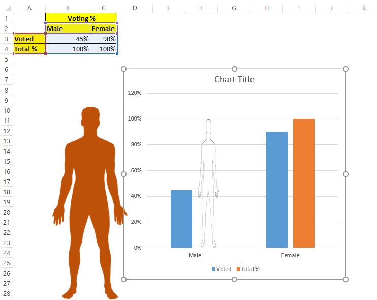
Select the transparent male image and copy it. Double click on the 100% male column in chart, so that only that column is selected. Now press CTRL+V. This action will replace the column with the transparent image of the male, as you can see in the image below.

Now copy the orange filled male image and do the same on voting % column of male. This will replace the blue column with the male figure. The image of the male will be complete but the height will be proportional to the percentage of data points.


We are done with the male figure.
Repeat the steps 3 to 7 for female image. In the end, you will have a chart that will look like something this.

Step 8: Check 'Stack and Scale With' option from the filling of the column.
Currently the images are stretched according to their percentage. We don't want it. Follow the steps below:
Double click on the male voted % figure (orange one), so that only that data point is selected. Now go to format data point --> Fill --> Check the radio button stack and scale with.

Now you can see that we don't get the scaled whole image but only the part of the image to show the percentage. Here, only 45% of the male figure is shown.
Do the same with the female figure in the chart.

Step 9: Adjust the series overlap to 100%.
Now go to the series option and make series overlap by 100%. This will make the data points in both series cover each other. The voting % will be completely visible, while the 100% series of male and female will look like shells, as shown in the image below.

Adjust the chart size and gap width as per your likeness.
The chart is almost ready. We just need to set the scaling of the axis.
Step 10: Set the maximum of the y axis to 1.0.
Select the y axis and go to axis option. Here in bounds sections find the maximum. Set it to 1.0.

Finally, remove all the non required elements like x axis, legends, chart title etc. from the chart. You have your chart ready. The male and female figure fills will change as the data changes.

So yeah guys, this is how you can have male-female inforgraphic in Excel that changes dynamically as the data changes. Use this chart in you dashboard to stand out from the crowd. I hope it was explanatory enough. If you have any doubts regarding this article or any other excel VBA related query, ask me in the comments section below.
Download the Excel Male-Female Infographic below:
Related Articles:
Creative Chart to Show Most Busy Time Excel: This chart is similar to the waffle chart but shows the density of data in a grid. The higher values are colored with a darker color and lower values are shown with a lighter color. This chart can be used in Excel Dashboards...
Fragmented Circular Progress Chart in Excel | In this article, we will learn how to create a fragmented circular chart in excel. By fragments, I mean a circular chart (doughnut or pie) that is divided into equal parts and progress is shown by highlighting these fragments
How to Create Color Changing Thermometer Chart in Excel | You can have a normal bar chart to visualize information but how cool will it be if you can show it on a Thermometer like Excel Graph. Even cooler, if the chart changes color when the value of risk or goal increases or decreases.
How To Create Speedometer (Gauge) Chart in Excel | Excel Speedometer or Gauge graph is one of the most popular chart types that attract managers. It’s easy to understand. It visualizes achievement or growth rate creatively.
How to Create Milestone Chart in Excel | A milestone chart shows the date or time when a milestone achieved in a graphical way. This graph must be easy to read, Explanatory, and visually attractive.
Creative Column Chart that Includes Totals | To include the total of the clustered column in the chart and compare them with another group of the columns on the chart is not easy. Here, I have explained, how to smartly include totals in the clustered column chart.
4 Creative Target Vs Achievement Charts in Excel |Target vs Achievement charts is a very basic requirement of any excel dashboard. In monthly and yearly reports, Target Vs Achievement charts are the first charts the management refers too and a good target vs Achievement chart will surely grab the attention of management.
How to Highlight When Line Drops or Peaks in Comparison Excel Chart | To compare two series in Excel chart and highlight the low and peak areas, we can use this advanced excel chart.
Popular Articles:
50 Excel Shortcuts to Increase Your Productivity | Get faster at your task. These 50 shortcuts will make you work even faster on Excel.
How to Use The VLOOKUP Function in Excel | This is one of the most used and popular functions of excel that is used to lookup value from different ranges and sheets.
How to Use COUNTIF in Excel 2016 | Count values with conditions using this amazing function. You don't need to filter your data to count specific values. Countif function is essential to prepare your dashboard.
How to Use the SUMIF Function in Excel | This is another dashboard essential function. This helps you sum up values on specific conditions.
The applications/code on this site are distributed as is and without warranties or liability. In no event shall the owner of the copyrights, or the authors of the applications/code be liable for any loss of profit, any problems or any damage resulting from the use or evaluation of the applications/code.