
How to make a bar graph in Excel?
Making a bar graph in Excel is a simple job. You have to know how to do it and then you will be able to go about the process of creating bar charts Excel. The objective of bar chart is to show the varying values for the different groups. This will help in drawing comparison.
You need to understand the process of creating bar charts through an example.
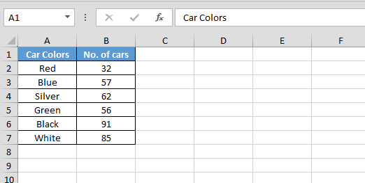
For instance, suppose you sit at the road side and count the number of red, blue, silver and green colored cars that pass by all through the day, then you know the number of cars in varying colors that plied the road.
Note down the count and enter the data in a table format. The independent variables are the colors of the cars and the dependent variables are the number of cars. Hence the independent variables will appear on the left side and the dependent variables will appear on the right side.
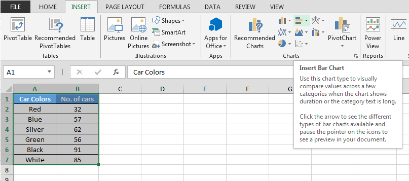
Now to create the bar chart, follow below steps:-

In above-shown image, you can see the bar chart; the visual comparisons become much transparent. Excel bar charts are much easier to create; you have to follow few simple processes.
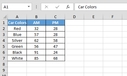
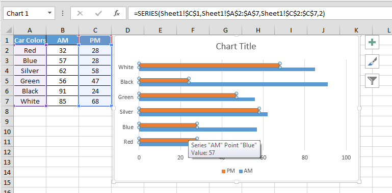
Now if you want a bigger comparison, then you may again go to the road side and count the number of red, blue, green and silver cars that you see at night.
Plot the whole thing on the same chart. When you compare the counts between AM and PM, you will understand the difference in counts. Select two different colors for morning and night so that you can understand the difference.
Follow below steps to see the number comparison:-
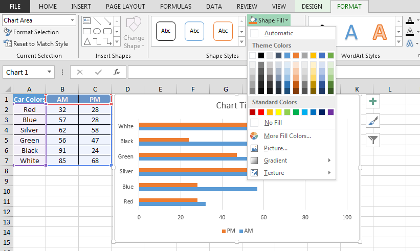
Now you can change the colors of shapes according to requirement.

Excel stacked bar charts are used to show two different series of any related data. Therefore, when you look at the example of the chart created from the two different counts observed in day and night for the various car colors, you will understand that it is the excel stacked bar chart. Otherwise, you can also create the same for different values for the same product and the quantity in which they have been sold in two different locations.
The different types of stacked bar charts are one on top of the other, separated, partially overlapped, mirrored, completely overlapped and hanged from top and bottom. Though the objective is same for all kinds of charts, it is supposed to show the two different counts.
Hence, once you know how to create bar charts, you know how to show the basic difference for the same product in two different situations.
![]()
If you liked our blogs, share it with your friends on Facebook. And also you can follow us on Twitter and Facebook.
We would love to hear from you, do let us know how we can improve, complement or innovate our work and make it better for you. Write us at info@exceltip.com
The applications/code on this site are distributed as is and without warranties or liability. In no event shall the owner of the copyrights, or the authors of the applications/code be liable for any loss of profit, any problems or any damage resulting from the use or evaluation of the applications/code.


