

About Dashboard:
This dashboard showscompany salestrend sorted by region, customer type, product, month& year.
The aim of this dashboard is to provide business insights about important areas of the sales process. With this dashboard, you’ll be able to identify the strengths and weaknesses in the sales process. The key focus of this dashboard is on showing sales credibility& management visibility.
There are several ways in which you can visualize sales data in order to understand the market trends and sales performance. In the month ofOctober, ExcelForumteamhas launched a dashboard competing in which you are asked to visualize data using sample data. The challenge has generated a huge thrill around the community and has fetched 118 incredible entries.
Thanks everyone for participating and making ita huge learning experience for everyone. ExcelForum team has learned several useful dashboard and charting tricks.
In this article, we will elaborate the method of creating this dashboard.
Let us see how the Dashboard made by tjulianna88 looks:
We have divided this dashboard into 8 sections of information. Let us take a look at each one separately.
Section1:
This section provides flexibility to the end user of selectingsingle or multiple regions at thesame time, and also the related information links will get updated automatically.

The above snapshot shows the highest as well as thelowest sales month of the selected region.
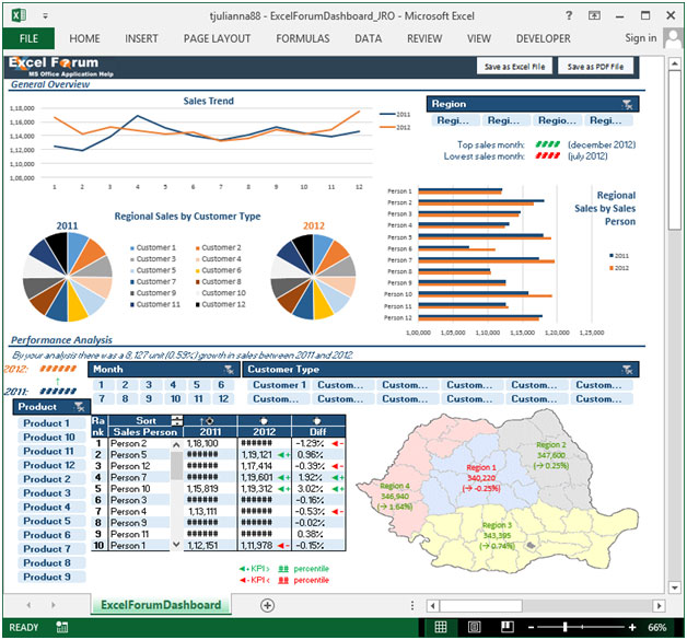
Section 2:
This section provides information on sales trend on the basis of month and year for the selected region.
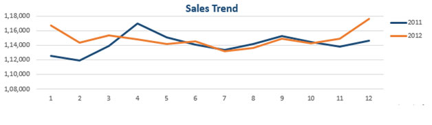
Section 3:
The following picture shows region sales by customer type.
Section 4:
This section highlights regional sales on thebasis ofsales person,using column chart.

Section 5:
This section contains performance analysis by product, month and the customer type.The map will be dynamically updated, region wise, in percentage.

If we select product 1 & product 12, then these products will be highlighted, and the information will be updated in map and rank table.

Section 6:
In performance analysis, there is this table that provides information about rank of sales person, yearly. We can find the topmostas well as thebottommost sales person.There is a scrollbar technique that is used to dynamically update the tablein order to see the entire sales person on a yearly basis & difference in percentage. This table can be sorted in both ascending & descending order.

Using this dashboard, you can get a clear view of the Sales industry and the information from various points of view.
Download Dashboard
The applications/code on this site are distributed as is and without warranties or liability. In no event shall the owner of the copyrights, or the authors of the applications/code be liable for any loss of profit, any problems or any damage resulting from the use or evaluation of the applications/code.


Great Work
Many Thanks
Frumos. Excelent.
multumesc 🙂
Hi tjulianna88. Great dashboard. I am trying to learn and perfect dashboards. Is it possible to see the worksheets associated with your finished product at all please?
You can find all the additional information in the file 🙂 (mostly on hidden sheets and in VBA comments)
In section 6 you can also change the percentiles value in order to redefine the conditional formatting 🙂
Do you have a guide for how you linked the data to a map?
There is no specific link 🙂 The map is a picture, I just added some text boxes. And I recolored them on every pivot update.
Are these posted dashboards just for presentation or can we open them up and adapt them for our use?
Thanks
Brian
Brian, there is a download link right above your comment.