

About Dashboard:
This dashboard focus on Human Resource of an organizationdepartment’s real time visibility of the data & insights.
With this dashboard, we can view various human resources statistics that automatically updates like headcount, payroll, salary distribution, employee numbers & sickness related information.
There are several ways in which you can visualize HR data to understand the objectives. In October month, Excelforum team has launched a dashboard competing in which you are asked to visualize data using sample data. The challenge has generated a huge thrill around the community and fetched 118 incredible entries.
In this article, we will show you the steps on how to create this dashboard.
Let us see the how Dashboard made by Sc0obylooks:
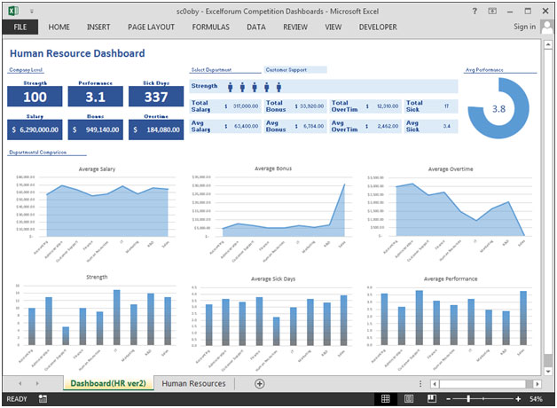
We have divided this dashboard into 4 sections of information. Let us take a look at each one separately.
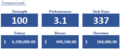
Section1:
This section shows Strength, Performance, Sick Days, Salary, Bonus, Over time.
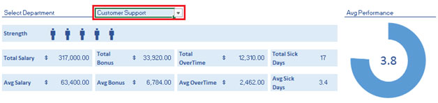
Section2:
This sections shows department related information which can be changed by using drop down list & all the below information like total salary, average salary, bonus, sick days & average performance will get updated dynamically.
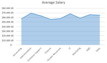
Section3:
The following is a departmental comparison chart on average salary.
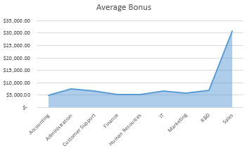
Section4:
The following is a departmental comparison chart on average bonus.
Section5:
The following is a departmental comparison chart on average overtime.

Section 6:
The following is a departmental comparison chart on Strength.

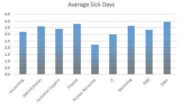
Section 7:
The following is a departmental comparison chart on average sick days.
Section 8:
The following is a departmental comparison chart on average performance.

After the detail comparison for each department, we can find out the department which is performing overall good & which department is not performing well.
Using this dashboard you can get a clear view of the Human Resource and we can get the information from various point of view.
![]()
If you liked our blogs, share it with your friends on Facebook. And also you can follow us on Twitter and Facebook.
We would love to hear from you, do let us know how we can improve, complement or innovate our work and make it better for you. Write us at info@exceltip.com
The applications/code on this site are distributed as is and without warranties or liability. In no event shall the owner of the copyrights, or the authors of the applications/code be liable for any loss of profit, any problems or any damage resulting from the use or evaluation of the applications/code.


Hi, It's very nice. Excellent job!
Would it be possible to have a link to download this template for my school assignment?
Thank you very much.
Very nice dashboard. Excellent job!
Is it possible to have a link to download this great dashboard?
Thank you very much.
Hallo,
this looks awsome. may I have the link to download it. That would be nice. Thanks in advance.
Great work
Hey Sc0oby, awesome dashboard! Can you please send me the link if that's okay? Cheers.
i like it
This dashboard is Excellent! It is simplistic and has a pleasant color scheme, with just enough information to compare and evaluate the functional teams. I have a few questions thought.
1. How is the overall data collecting?
2. Is the data one spreadsheet/template, or do you need several sheet to collect and house all the input data?
Great Job!
Very nice dashboard, may I have the link to download please. Thanks in advance.
Thanks for sharing this sc0oby, it's given me some great ideas.
Hi, Great dashboard, which I have managed to replicate, and would appreciate link to file/template to compare functions etc. Thanks JH
GR8 Work here, please email this dashboard to:
neptune.joel@gmail.com
I'm wondering how much dynamic is this one
many thanks.
hello, great work!!
Can you send me this dashboard?
This looks very nice. Excellent work. Would like to get a template download for this. How can I pick it up.
Doug
Hi @sc0oby. That's a great looking dashboard. Can I have a link for a copy for my education?
Thx.
Used this for our new dashboards im producing, a good clean look and just what I was looking for. Easy to replicate and excellent clear data on show
Great dashboard. Congratulations. Can I get a link to the download please?
Can I get a link to download this file ? Thank you very much !
Great looking dashboard! Can I please get a link to download the file?
Hello
Can I get de file Dashboard? I like too much. Thanks