
Target vs Achievement charts is very basic requirement of any excel dashboard. In monthly and yearly reports, Target Vs Achievement charts are first charts the management refers too and a good target vs Achievement chart will surely grab attention of management. In this article we will learn how to convert boring chart into a creative and compact charts.
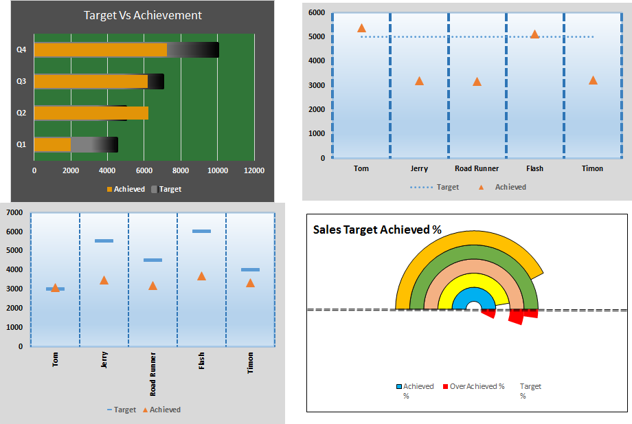
The Racetrack Target vs Achievement Chart
In this chart, the target looks like a containere and the achievement bar looks like a trail. So let’s see how to make this advanced excel chart or graph.

Here I have data of 4 quarters of a year in excel. Each quarter has a different target. In the end of year we complied the achievement in adjacent column.

Now follow these steps to create excel chart.
1. Select the entire table.
2. Go to Insert? Charts? Column/Bar Charts? Clustered Bar Chart.

3. Although this chart shows the target and achievement but this bar chart is boring and taking to much space.

Let’s rock it. Right click on the achievement column and click on formate data series. In Excel 2016 edit options are shown in the right corner of excel window. In older versions you’ll have a dialog box open for formatting.
4. Now go to series option, adjust series overlap as 100%. And reduce gap width to 75% to make it look bolder. The achievement bar will cover the target bar.

Now it looks compact. You can reduce the size of chart to your requirement. But it still doesn’t look like we want it to be.
5. Select the target and go to format data series. Go to fill. Select gradient fill. In direction, choose linear left. And choose colors for gradient fill.
6. Without exiting, scroll down and go to border. Select gradient fill and repeat the above procedure. Increase the width to 3pt.
7. Now it has started to look like it. Select the achievement bar. Color it if you want. I left it as it is. Select the background and color it as you like.

Here’s what I’ve done.
8. Select the chart. Click on the plus sign. Uncheck primary vertical lines and check horizontal lines. Select lines and increase thickness.
And it is done. As the target increases the orange line will move up. And if you over achieve the target it will break the boundaries of container.
2. Creative Swimming chart in Excel with runners
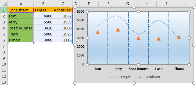
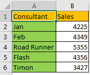
Let’s say we have this data of different consultants with same target for sales of our products.
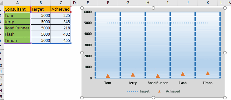
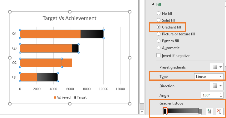
Here, the target is fixed for everyone and every salesman is hustling to achieve this target. Now, this target is like a Finnish line on the swimming pool. In this excel chart, we will show these consultants as the swimmers. As their sales increase they will move closer to the finish line. OK. Let’s start.
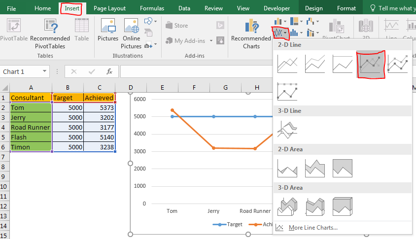
1. Select the data and plot a dotted line chart. Go to Insert? Insert Line chart-->Line with markers.
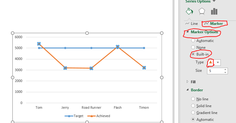
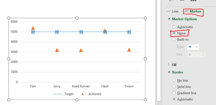
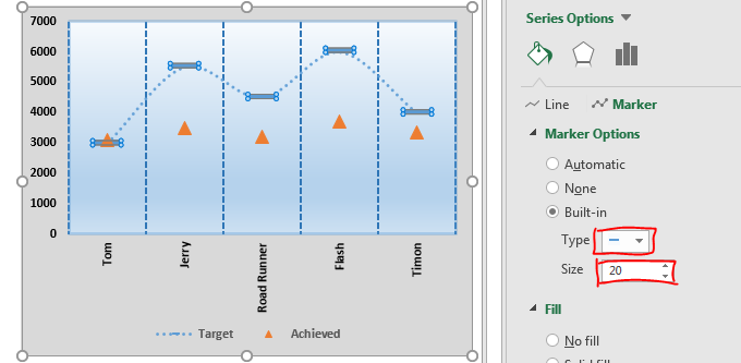
2. Select the achieved line and go to format data series. In Format Data Series, click on markers option. Here, select built-in and select a triangle. Adjust the size as per your requirement.
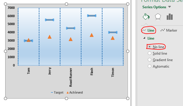
3. While having selected the achieved line go back to line option and select no line.
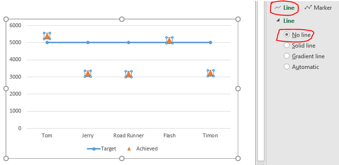
4. Now it has started to like the graph we want. These triangles represent the consultants or say players on our company.
Now select the target line. Go to format data series option. In line select dash type, whichever you like. I have chosen stars.

5. Go to markers option and select none for the target line in the chart. We don’t need markers for target line.
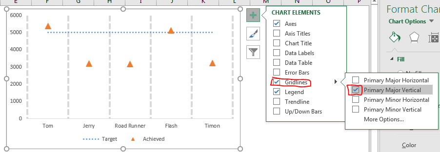
6. Next, select the chart, click on plus sign and in gridlines options, deselect the primary major horizontal lines and select the primary major vertical lines. You can also select minor horizontal line lines for having precise visual data.
7. Go select major gridlines and go to format gridlines. Here select the dotted lines and increase thickness. Select the appropriate color for the gridlines. I have selected blue.

8. Now select the whole chart by click on blank space on chart and go to formate chart area. Here select gradient fill. Make a water gradient. Similarly do some extra formatting to make your excel chart look more sporty.
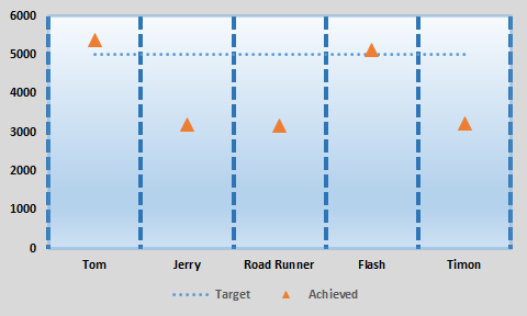
Finally your creative excel chart is ready that looks an swimming competition.
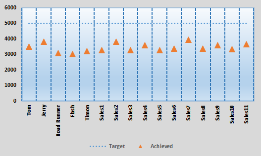
This graph can be great too where there are multiple variables. This excel chart will be perfect to visualise a number of lines.
3. Swimming Excel Chart With Different Targets
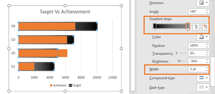
In above example, we had a fixed target for everyone. Now if you had different target for different employee then this chart would not be helpful. This chart will look weird.
To set different finnish lines for every swimmer follow these steps.
1. Select the target line. Go to format line option. Select marker option and then select line marker.
2. Go to line option and select no line for target.
And it’s ready. Each swimmer has its own finish line. Use this excel chart visualise data in creative and make your business presentation stand out.
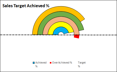
4. Creative Excel Donut Chart for Target Vs Achievement

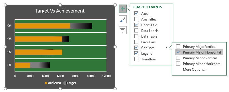
Sometimes over achieving a target is not a good thing. Maybe because client will not pay for the work done more then the set target. In that case our chart in excel should alert when a target is over achieved.
Here I have this data.
Now I will plot a donut chart In this donut chart we will show the percentage target achieved. Whenever the target is overachieved, we will mark the extra achieved target as red.
Let’s get started.
1. Add three more columns. Achieved %, Overachieved %, and Target %..
In achieved write formula =sales/target salse. Our sales is in B column and let’s say target is 5000 then Achieved formula will be =B2/5000. Copy down this in below cells.
In overachieved%, we want data only if achieved % is greater than target %. To do so write this formula in D2 and copy it down.
=IF(C2>E2,E2-C2,0)
In target% write 100% for all. Since we want everyone to achieve 100% target.

2. Now select this data, go to insert tab. In chart? Donut chart.
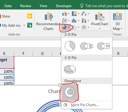
3. For now this chart looks nothing like we want it. Right click on chart and click on select data. Select Data source dialogue will open. Now uncheck the sales in legends and entries. Click on the button Switch Row/Column on the top

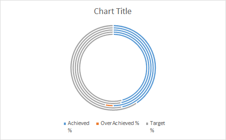
Now the donut chart will look like this.
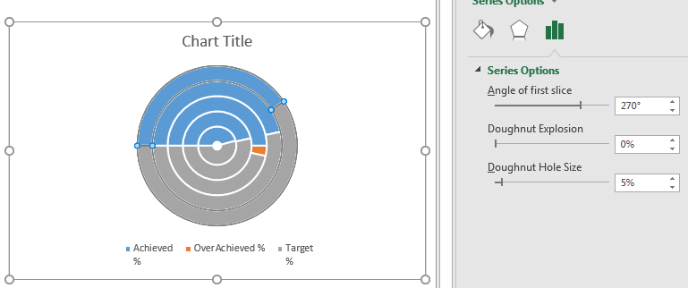
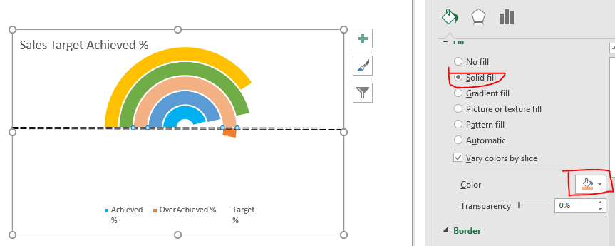
4. Right Click on the donut and click on formate data series. Set angle of first slice as 270 and reduce donut hole size to 5%.
5. It has started to take the shape. Now Here blue line indicates achieved%. Orange Over Achieved and grey part is 100%.
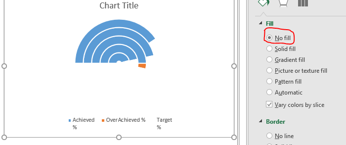
We don’t need to display target % here. So double click on each gray donut slice. Go to fill? and select no fill. Go to borders and select no line.
6. Now let’s add an axis. Go to insert ? shapes? Line. Draw line horizontally, ghoing through the center of donut chart.
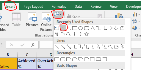

When the chart flows through the axis it means that we have over achieved target. I have done some formatting for line. You can do that too.
7. As we know that each circle represents each consultant. So I am going to give them a different color, so that I can Identify them visually.
Select each blue circle separately and go to format data point. Color them differently.
8. Next, we need to formate overachieved% data as red. We can only format chart if we are able to select it. Increase the achievement % so that we can see each part. Now we can see overachieved part in chart.
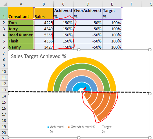
9. Select each slice and color them red with no borders. By now you know how to color chart parts in excel.
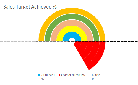
10. Restore the formula in Achieved %. Now just do a little bit of formatting for background and text. Do it in your style. Add borders and all that.
So yeah it’s ready. You can now use it in your excel dashboard, business meeting and wherever you like. There are lots of creative charts on exceltip.com. Don’t forget to check them out too. If you have any doubt or query regarding Excel 2019/2016 or older, feel free to ask questions in the comments section below.
Related Articles:
Pie Charts bring in Best Presentation for Growth
“Waterfall” Chart in Microsoft Excel 2010
Popular Articles
50 Excel Shortcut to Increase Your Productivity: Get faster at your task. These 50 shortcuts will make you work even faster on Excel.
How to use the VLOOKUP Function in Excel: This is one of the most used and popular functions of excel that is used to lookup value from different ranges and sheets.
How to use the COUNTIF function in Excel: Count values with conditions using this amazing function. You don't need to filter your data to count specific values. Countif function is essential to prepare your dashboard.
How to use the SUMIF Function in Excel: This is another dashboard essential function. This helps you sum up values on specific conditions.
The applications/code on this site are distributed as is and without warranties or liability. In no event shall the owner of the copyrights, or the authors of the applications/code be liable for any loss of profit, any problems or any damage resulting from the use or evaluation of the applications/code.


