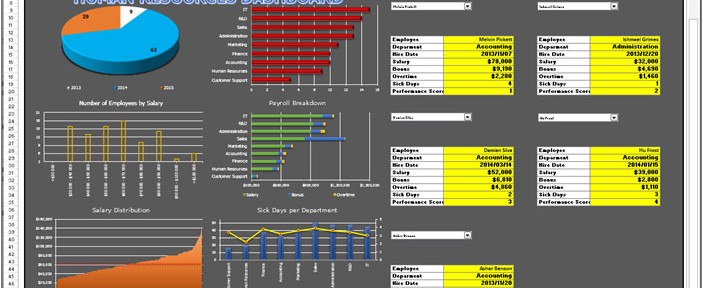
About Dashboard:
Human resources: - Human Resources play a very key role in an organization. Human resource are have so many responsibilities such as hiring the candidates for a company, and ensuring they wouldperform well and check their previous records.
Human resources makes policies regarding Leaves, Salary Distribution, Manpower, Employee Data Manage, Performance Allowances, and Provident Fund etc.
Human resources dashboards are useful to analyze the performance and improvement area of resources, employee satisfaction. We can finalize the salary standard for every level and designation accordingly.
Let’s understand with a dashboard how we can prepare it and how it will be useful for us to analyze and maintain the company standard.
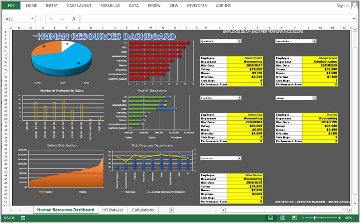
Chart:-Employees Hiring
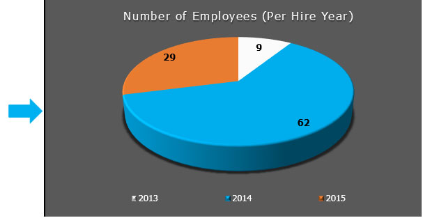
To show the number of employees on yearly basis 3D Pie chart is used. In this chart we can see that 29 employees are here in the year 2015, 62 employees in the year 2014, and 9 employees are there in the year 2013.
Chart:-Headcount Department Wise
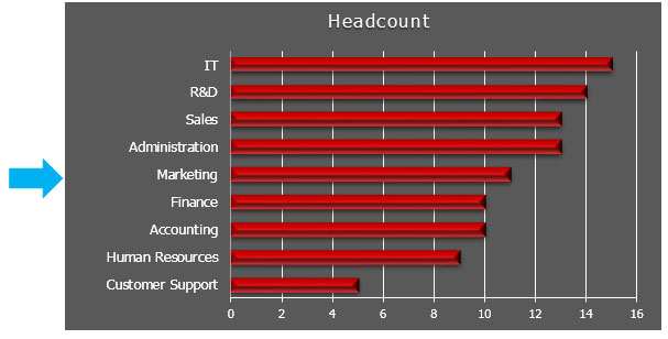
To show the headcount for every department, we used Bar chart. In this chart we can see IT department is having very low headcount among all other departments.
Chart:-Number of Employees by Salary
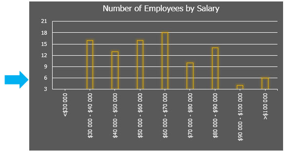
To show the number of employees by salaries, we used Column Chart. In this chart we can see that under salary $30,000-$40,000 criteria number of candidates are above 15 candidates.
Chart:-Payroll Breakdown
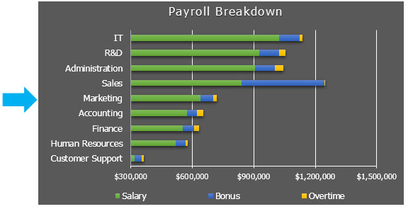
To show the payroll break down department wise we used Bar Chart. In this chart we can see Payroll break down as bifurcated (Salary+Bonus+Overtime). Through this chart we can analyze that Sales department is taking the highest bonus among all departments, IT department is taking the highest salary among all the departments and administration department is taking the highest overtime among all the departments.
Chart:-Salary Distribution
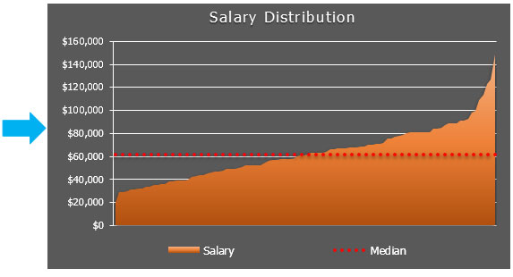
To show the salary distribution weused the combo chart to Area and Line chart. In this chart a median line is inserted.We can analyze that below the median chart how much salary is distributed and above the median line how much salary is distributed.
Chart:-Sick Days per Department
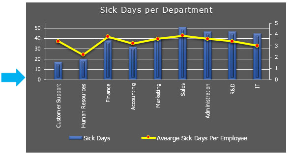
This chart is usedto show the Sick days. We used combo chart of Column Chart and Line chart. We can analyze how many employees have taken the sick day leaves.In this chart we can see that sales department have taken more leaves compared to other departments.
Salary Slip
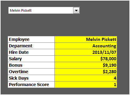
In this table we have a salary slip in which few details are mentioned such as Employee name, Department, Hire Date, Salary, Bonus, Overtime, Sick Days, and Performance.
The applications/code on this site are distributed as is and without warranties or liability. In no event shall the owner of the copyrights, or the authors of the applications/code be liable for any loss of profit, any problems or any damage resulting from the use or evaluation of the applications/code.