
Charts are used to convert the numeric data in a graphical format. Its useful to analyze the data.. It makes it easier to understand large amount of data and the association between different series.
In Microsoft Excel, when we want to present a chart to analyze the movement of data, we need to add a reference line, so that we can easily understand how the performance is & where there needs to be improvement.Let’s take an example and understand how you can add a reference line to a chart.
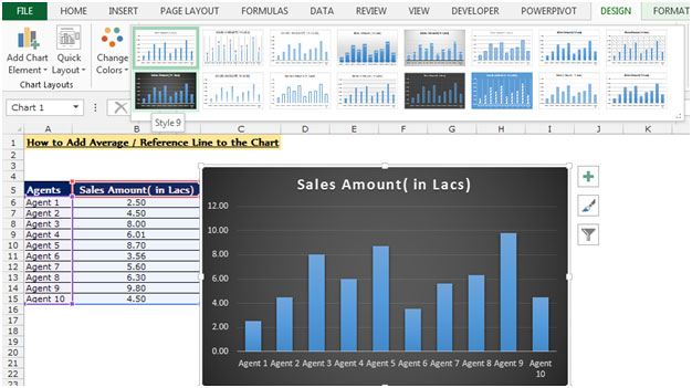
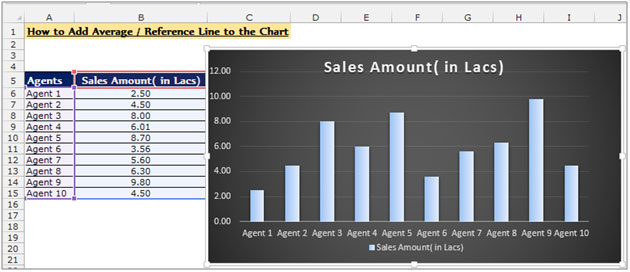
Let's take an example :-
We have sales performance data, in which we have the agents name and the amount of achieved sales. To insert a horizontal average line in the Chart follow the below given steps:-

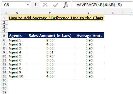
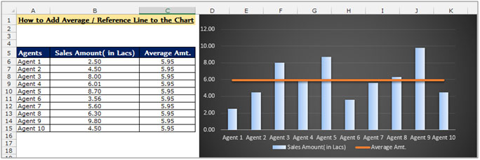
Conclusion:- Now you can see the average line in the above chart which is clearly showing agents whose performance is above and below the target.
![]()
If you liked our blogs, share it with your friends on Facebook. And also you can follow us on Twitter and Facebook.
We would love to hear from you, do let us know how we can improve, complement or innovate our work and make it better for you. Write us at info@exceltip.com
The applications/code on this site are distributed as is and without warranties or liability. In no event shall the owner of the copyrights, or the authors of the applications/code be liable for any loss of profit, any problems or any damage resulting from the use or evaluation of the applications/code.


Very brilliant you explained.
This is really easy for us learn the Excel from you, In a very simple way you taught us how we can add the reference line in the chart. Thanks 🙂